The houses are all made out of ticky-tacky and they all look just the
same. Dan Graham started photographing them in 1965. It was New Jersey.
They were photographs of suburban homes and tract housing. The
excitement of postwar consumerism had faded by then. A new wave of
melancholy was settling on the American mood. Politics were getting
hotter. Suburban life was getting duller.
- “Dan Graham: Beyond” at the Whitney Museum of American Art. Through Oct. 11, 2009.
Dan Graham — whose work from ’65 to the present is currently on exhibit at the Whitney Museum of American Art — has made a lot of art since then. But the photographs from the series “Homes for America” still stand out. As they’ve aged, they’ve become more elusive. In the mid-’60s, it was easy to see the polemics of the photos. Their monotonous repetition critiqued mass-produced lives in a mass-produced culture. Or they were an attack on the over-intellectualized art coming out of the academy and the art world at the time. This was a populist backlash against the avant-garde in all its permutations. Graham was making art that commented on the everyday streets of New Jersey.
It turns out that Dan Graham never set himself either of those lofty goals. He was simply interested in the way that the urban landscape was changing. The shapes were different, the colors were different. He liked New Jersey. What the pictures show now, over 40 years later, is that Dan Graham was really looking. It is now easier to see that Graham was driven by formal questions all along. He was drawn to the serial nature of the homes, the way they iterated the same thing with tiny differences over and over again. In the text he placed next to his photographs you can read things like, “Each block of houses is a self-contained sequence — there is no development — selected from the possible acceptable arrangements.
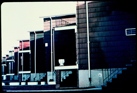
Graham was excited about the sharp angles on the homes, one after another, all the way down the street. The roofs catch the sunlight just so. Color and light explode out of the hard shadows. He dug the way drainpipes are just a white line. This was not a great revolt against Minimalism so much as a new way to play the Minimalist game.

The photograph above could almost have been taken by Robert Morris or Donald Judd with its geometric purity and its framing of the houses as serial productions. The Minimalist in the gallery places three iron poles exactly the same size against a white wall. Dan Graham says, Why bother? Sculptures like that are being made in every neighborhood of America every day.
In a way, he showed the artists of the ’60s where all their grand ideas were really coming from. The repetition and formal play in the galleries and museums was an abstract way of reproducing what was happening in urban design and in the shopping malls of America. Graham wanted to learn about this new world, to understand its ways.
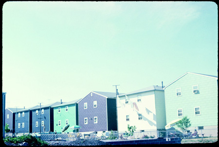
Graham once called “Homes for America” a suburban arcadia. The aging of the prints, the mid-’60s patina, really brings that out now. The light is otherworldly. We can see the little houses through Graham’s eyes and see their beauty.

The houses above are delicate and kind. The four little windows on each house project a familial comfort as much or more than suburban ennui.
That doesn’t mean they are good. “Homes for America” neither advocates for nor condemns suburban living. It simply says these homes are beautiful. Graham was a precocious young man to see that beauty over 40 years ago, to understand that new structures and new ways of living demand a new way of seeing. Only now can we realize how right he was. • 3 September 2009


