


If you’re seeking some suggestions for celebrating Helvetica’s 50th birthday, might I recommend a trip to New York’s Museum of Modern Art, which is presenting an exhibition devoted to the typeface? To mark the occasion, the MOMA acquired an original set of 36-point lead Helvetica letterforms. Of course, I don’t need to tell you to fly American Airlines to get there (their fuselage bears the grand imprint of Helvetica, as does and Lufthansa). Those looking to save money might consider renting a Toyota from National, or taking a Greyhound or Amtrak to New York (all of the aforementioned companies use Helvetica in their logos). Once in Manhattan, don’t forget to take a ride on the subway system, whose signage utilizes – you guessed it. And be sure to sip some VitaminWater, shop at American Apparel, and memorialize it all with your Olympus camera (powered with Energizer batteries), since all of these products boast Neue Haas Grotesk, as Helvetica was originally named.
If, by now, you are scratching your head, mumbling about how you thought Helvetica was supposed to be opening for The Killers, don’t feel bad. (And, perhaps more importantly, don’t stop reading this essay.) Helvetica’s lack of name-brand recognition is not your fault. Typography is considered an invisible art, and Helvetica’s ubiquity makes it even easier for it to disappear into the background, overshadowed by the meaning of the words it makes visible.
Despite warnings that reading is a dying hobby, we are confronted with an astonishing number of written imperatives each day. We are told to pull or push doors, keep clear of fire exits, use caution with automatic doors, and Eat at Joe’s. But it isn’t only what is being said, but how these messages are being delivered. Typography is not simply a frou-frou debate over aesthetics orchestrated by a hidden coterie of graphic-design nerds. You need only imagine a STOP sign that utilizes the heavy-metal typefaces favored by bands Dokken or Krokus to realize that clear, clean and direct typography can save lives, or at the very least prevent drivers from prolonged bouts of confused squinting.
And so, before delving into the historical and sociological aspects of Helvetica, let us start by thinking small for a minute, and focus on the i•n•d•i•v•i•d•u•a•l letters. Observe the fancy little dangly bits off the top and bottom of letters such as:
T, H, and F
(Feel free to grab a magnifying glass.) Those are called serifs. (Most print text is typeset in serif fonts, and those serifs are supposed to make reading longer articles easier on the eyes.) Since Helvetica is bereft of such accoutrements, it is a sanserif typeface. Its lettering is crisp yet rounded, helping it to communicate effectively, without drawing undue attention unto itself.
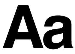
Typefaces generally rely on subtle alterations to make their impact. In his photo-heavy book Helvetica, designer Lars Müller praises the titular typeface for its “understated self-assurance” – describing it as if it were an especially pleasing glass of shiraz. In the same book, designer Katherine McCoy goes further, arguing that, “The Helvetica Medium lower-case `a’… is the most beautiful two-dimensional form ever designed. Its luxurious sensual curves are balanced by points of crisp tension. Its lovely counter makes me think of Mozart.”
Why is Helvetica praised like this? Certainly no one is singing from the rooftops about Times New Roman. But Helvetica is more than simply a popular typeface. Many consider it the official typeface of the 20th century.
Helvetica has played a crucial role in providing shape and tone to the modern visual landscape – the “perfume of the city” in Müller’s florid words. And Helvetica’s Q-Score is currently skyrocketing thanks to filmmaker Gary Hustwit (director of I Am Trying to Break Your Heart about rock band Wilco) whose documentary Helvetica has been receiving rave reviews.
Critical acclaim is wonderful, but the film is packing theaters, too. Helvetica was the first film to sell out both performances at Toronto’s recent Hot Docs festival. Helvetica-mania has also resulted in standing-room only shows in New York, Istanbul, Prague and the South by Southwest Festival in Austin.
As director Hustwit explains via e-mail, “Seeing people lined up around the block for a film about a font is pretty strange. But when you think about it, we all use fonts every day now. The [publication] that this interview is printed in is obviously full of fonts. So why shouldn’t people want to know more about something they see and use every day?”
At the risk of being a film spoiler, the history of typography is not steeped in sex, murder or intrigue. The occasional kidnapper might still create a ransom note using cut-out letters snipped from the newspaper, but there it ends. Still, there are plenty of colorful moments in the history of typography, although they’re as easy to overlook as Helvetica itself. It’s a classic figure-ground problem. We tend to think of Gutenberg’s printing press as revolutionary, because it allowed the dissemination of incendiary material such as Luther’s The 95 Theses. Content can have radical aims or outcomes, but what about the individual letters that give body and tone to the content?
During the early 20th century, various avant-garde movements decided to stop minding their Ps and Qs (and the other 24) as they experimented with the power of type. Starting in 1909, the Futurists scattered words and letters across the page for poetic effect, and various manifestos relied upon typographic tricks to underscore bellicose sentiments such as, “We will destroy the museums, libraries, academies of every kind.”
Wyndham Lewis leveraged Futurist innovations in the layouts of Blast, the Vorticist magazine, while the Dada clan used photomontage and collage to draw attention to their worldview. The Constructivists, especially through the work of El Lissitzky, converted type into a form of illustration, reinforced by the letterpress innovations of the Bauhaus and de Stijl movements.
A few decades later, during the 1940s, poet Jean-Isidore Isou tried to bury the bourgeois institution of the word entirely – the manifesto of his Letterist movement heralds “the destruction of words for letters.” Isou believed that the letter would became the building block of a new art in which poets would reduce their outpourings and impulses to letters.
The goals of the Haas Type Foundry, the company responsible for creating Helvetica, were far more modest than Isou’s. Edouard Hoffmann, the foundry’s director, asked Max Miedinger to update Akzidenz Grotesk, a popular typeface created in 1896. The result was Neue Haas Grotesk, which debuted to little fanfare in 1957. Swiss-school design emphasized order and linearity, a mandate compatible with Helvetica’s austere look and feel.
Four years later, at the behest of Mergenthaler Linotype (Haas’s parent company), the name was changed to Helvetica (Helvetia is Latin for Switzerland) as part of a marketing plan to sell the typeface internationally. The new name was meant to leverage the growing popularity of Swiss design, and it worked. Ad agencies, and anyone else seeking to imbue their posters or products with 1960s cosmopolitanism, used the typeface, and by the 1980s it was everywhere, thanks in part to the fact that Helvetica came bundled with the first Macintosh computers.
As mentioned earlier, print text is typeset in serif fonts. Although serif fonts are meant to ensure that readers will savor each delicious word, there is nothing intrinsically legible about the typeface. At least, that’s the claim Eric Gill made in his “An Essay on Typography” published in 1931: “Legibility, in practice, amounts simply to what one is accustomed to.”
Almost 60 years later Zuzana Licko made a similar argument in the design magazine Emigre, writing that “Typefaces are not intrinsically legible; rather, it is the reader’s familiarity with faces that accounts for their legibility. Studies have shown that readers read best what they read most.”
Which means the heavy metal STOP sign example was humorous but somewhat inaccurate. Grow up in a city like Röcksterdam, where gothic lettering predominates, and you’ll soon acclimatize.
The legibility claim appears counterintuitive at first, but evidence for Gill and Licko’s claim can be found in your hands. “Newspaper typography has created some of the very worst typefaces, typesetting, and page layouts known to mankind,” write designers Erik Spiekermann and E.M. Ginger in their book Stop Stealing Sheep & Find Out How Type Works. “Yet we put up with bad line breaks, huge word spaces, and ugly type, because that is what we are used to. After all, who keeps a newspaper longer than it takes to read it? And if it looked any better, would we still trust it to be objective?”
Although Licko would probably agree with Spiekermann and Ginger, her legibility argument was made in a particular context: the emergence of the digital foundry. The laborious, physical process of creating a new typeface by carving it out of metal is no more.
Now, any fool with a computer can generate their own typeface, which leads to the stylistic chaos and excess witnessed in Gen-X magazines like Raygun and Speak. In 1990, Erik van Blokland and Just van Rossum created FF Beowolf Serif 23, a “random” font that constantly tweaks its shape and outline so, like a snowflake, no character is ever repeated.
Jonathan Barnbrook, meanwhile, created Burroughs (named after William S.), which substitutes coherent input with a river of gibberish. These are extreme examples, but for Licko, the jagged, cutting-edge typefaces of today may become the Helveticas of tomorrow.
Technology giveth but it also subtracts. The computer has brought into being a new typographic scourge while at the same time providing the means for complaining about it vociferously. I’m referring to Arial, a typeface meant to mirror Helvetica, but a typeface that many would prefer to call Jezebel. On his Web site, designer Mark Simonson explains why Arial is a poor imitation of Helvetica, calling it a “parasite.”
Simonson also includes a guide to spotting the differences between the two typefaces, detailing Arial’s flaws like a judge on Next Top Model. Arial might be guilty of minor ocular transgressions, but there are far worse offenders, such as Comic Sans, a typeface that bestows one’s writing with all the verve and elegance of Porky Pig.
Perhaps the most relevant benchmark of typographic success is sheer perseverance. Will Helvetica survive another 50 years? Maybe. Frutiger is starting to replace Helvetica in many business contexts. And designers are hardly unanimous about its appeal. In Müller’s Helvetica, Wolfgang Weingart describes the typeface as “the epitome of ugliness,” while Keith Godard suggests, “like a beautiful person, it often lacks personality.” Rick Poyner, meanwhile, complains of its “bloodless neutrality,” a rather fitting comment to be making about a Swiss typeface.
Regardless of its future, Helvetica has left its marks on modernity. “I think it’s changed the world, but probably in a very subtle way that most people wouldn’t realize or even care about, frankly,” explains filmmaker Hustwit. “When you’re parking your car, and you want to know whether you can park in a certain spot or not, you just want to get that information quickly and clearly.”
Helvetica might boss us around, but we continue to appreciate its no-nonsense efficiency and reserve. Like it or not, it’s clearly our type. • 5 November 2007