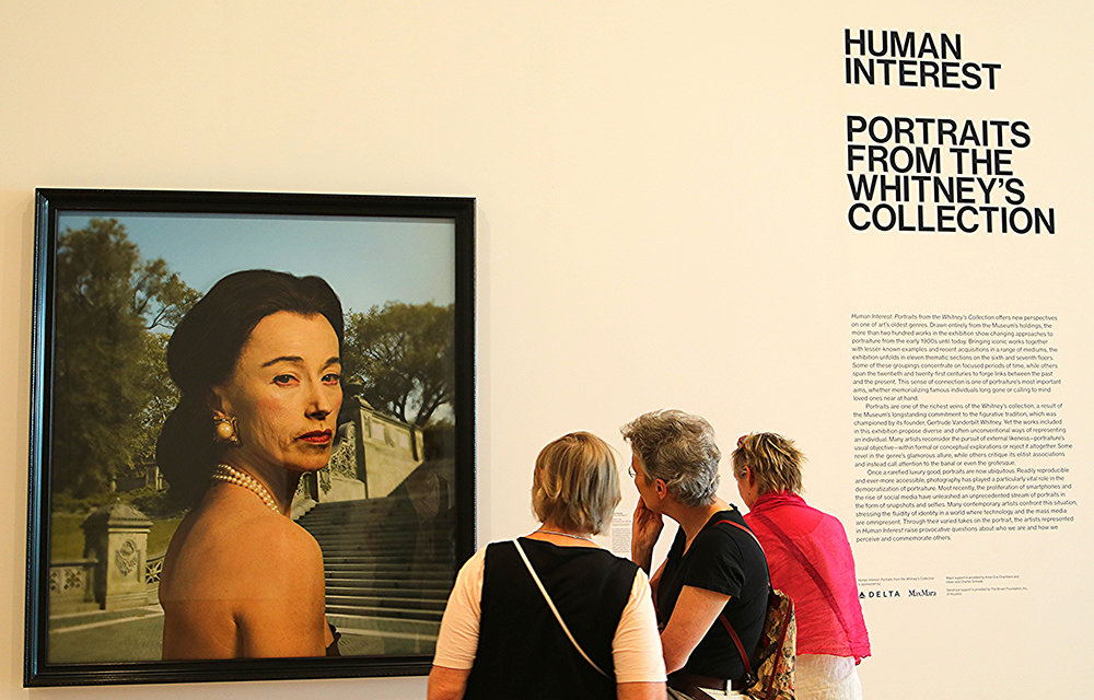
For several centuries the pose in a portrait served as a key element, and was often joined chiefly with the sitter’s clothing, and occasionally the background, as crucial supplements. These three elements — the body held, covered, and situated — were enlisted to support the emotional meaning of the work. Moreover, the elements were generally in service to the look on the subject’s face. This look was meant either as an expression of a true identity or as a comment on the world (including the viewer) onto which the subject looked. The resulting overarching emotion might embrace hauteur or graciousness or melancholy, emotions that could possess an ironic cast, but were often presented as pure and unadulterated. This complex of emotions is usually what catches us and holds us, inviting us to return gaze for gaze, to repay alert sensitivity with open absorption.
What might have succeeded as a fairly restricted genre in lesser hands has over the years become studded with exemplary instances that are among the most memorable achievements in oil painting. These singularities, as happens with works of art, redefine the general category even as that category’s limits reassert their usefulness in conveying a distinctive power and presence. Portraiture proceeds as if all faces show the truth they mean to, regardless. Such truth is its own and gestures towards the world-wide ambit (I avoid the “universal” as being too encompassing). A portrait asks us to single out a face and by extension a human being, while the limits of the genre recall the limits of the species. These various tensions-in-perspective invite us to measure up ourselves, as if our own uniqueness were guaranteed.
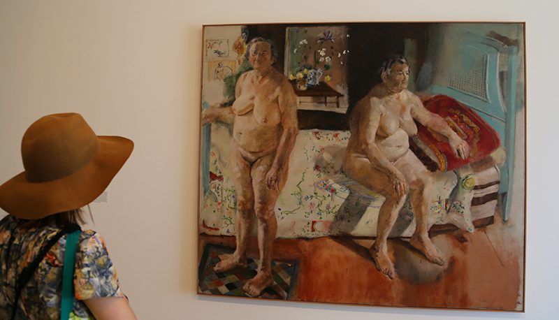
Portraits have widely ranged from Hans Holbein’s Henry VIII to Leonardo da Vinci’s Mona Lisa to Pablo Picasso’s Gertrude Stein, all of whose subjects exude power of one kind or another. Then there are the examples that gain their power not from office or legend or reputation, but rather from some core of rich feeling that approaches the numinous or magical. Here I would suggest Velazquez’ water-seller from Seville or Manet’s Olympia. One of my favorite examples of this numinous category is George Bellows’s “Elinor, Jean and Anna” (1923), a portrait of his young daughter flanked by her grandmother and her great aunt. In addition to his spirited handling of the paint, Bellows conveys growth and age pairing off against one another and evoking an analogous meeting between innocence and experience. The heaviness, as it were, of the emotional charge of the delicate grouping is borne by the look of wisdom in the faces of the two elderly women as the young girl awaits her share of a fate she cannot yet name or acknowledge.
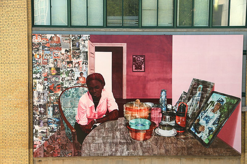
“Human Interest: Portraits from the Whitney’s Collection” is on display until February 2017. Besides amply illustrating the richness of the Whitney Museum’s holdings in contemporary art, the show gives us a welcome chance to see how two large categories can meet and modify one another: portrait painting and contemporary art. The curators of this lavish offering of more than 200 paintings invoke the museum’s tradition of figurative art to contextualize the fact there are many portraits in their archive, some of them not displayed for long periods. But the new Whitney has made room (in its new and superbly laid out galleries) and also moved forward from the early core of the collection – the first three decades or so of the 20th century – to a sharply contemporary range, featuring many of the most famous living American artists. The genre of the portrait serves as the main organizing principle, but “portrait” taken as freely and actively redefining its generic limits.
The show’s curators (a team comprised of Dana Miller, Richard DeMartini, Scott Rothkopf, Mia Curran, Jennie Goldstein, and Sasha Nicholas) set out simple but helpful formulations. In keeping with much of the discourse around contemporary art – itself a panorama of approaches desperately trying to maintain pace with the myriad of styles – they suggest that the portrait genre itself is facing great pressures. These include challenges to the many media and the freedoms displayed as various forms and styles are chosen, scrutinized, juxtaposed, discounted or celebrated. Here is how the curators see it:
Many artists reconsider the pursuit of external likeness — portraiture’s usual objective — within formal or conceptual explorations or reject it altogether. Some revel in the genre’s glamorous allure, while others critique its elitist associations and instead call attention to the banal or even the grotesque.
Welcome to post-modernism and a glimpse of what lies beyond. One of the headier revelations at this new museum is the difference between the portraits on the seventh floor, largely painted before, say, 1980, and those more recent, consigned to the sixth floor. What follows are comments on the sixth floor offerings (the seventh floor being beyond the scope of this brief essay).
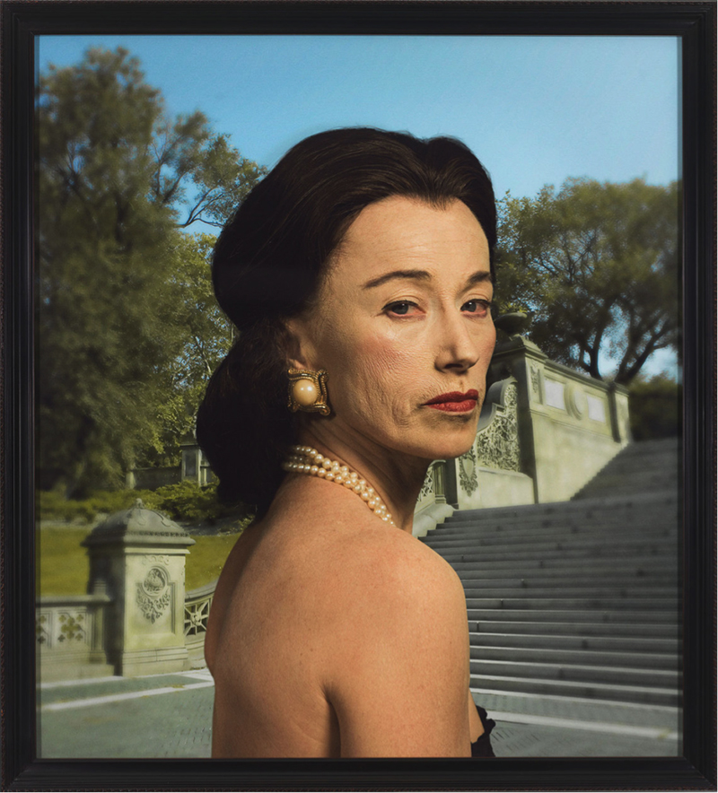
When the elevator door opens on the sixth floor we see three quite large portraits by three of the more famous contemporary artists, representing something like an introductory make-work, temporary spectrum. From the start the expected features of portrait genre are under such pressure that we have entered into a new model of physiognomy. On the left, a familiar Cindy Sherman. The artist herself hidden or remade with a full face of make-up offers a very blank look. It could be seen as a self-portrait in disguise, or more like a would-be portrait of a non-someone, Sherman as a generic socialite photographed without (or with very few) props. The work de-realizes the actual while promising something will come of a second look. A head shot may be the most banal of photographs, the most effortless of media, but here we see how it can display its emptiness while raising questions about how all performances flirt with irony, if not unwitting satire.
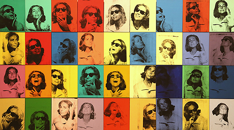
The middle canvas contains a group portrait by Alex Katz. In the faces of each member of the group the flat passages of distinctively chosen colors take the place of modeling and subtle contrasts. What has been borrowed from the style of comic books reappears here as high style, or at least an approximation, since the poses and clothes clearly suggest wealth and leisure. We can’t say we know these people, but we can affirm that they are in the know, as the old fashioned phrase has it. They are in good shape, beyond the buzz and brutality of their mode de vivre. Katz presents his faces as if they were carved friezes, and the pun on the word determines the aura. Much is being withheld and what is manifest speaks of cultural limits. The portrait on the right is by Chuck Close, his many squares of slightly rippled color showing us how any face is — or can be treated as — a grid of lesser visual moments unraveling a hard-to-comprehend unity. Both Katz and Close are so well known that their achieved styles, which they employ almost exclusively, could be a sub-genre — the “Close” face, or the “Katz social mask.”
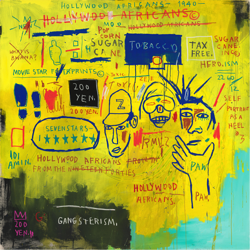
But stroll on past the first three works and things change rather quickly. First comes a phantasmagoria from Jean-Michel Basquiat. Against his typical yellow background lie assorted words and objects and what might be considered visual punctuation marks. A scrambled message, made of palimpsest and collage and a packet of deconstructed idioms: the stylized strokes of paint seem done with a stick rather that with a bristled brush. The wall text directs the response, for this is a self-portrait, but heavily coded. For example, in the lower right corner a vertical row of numbers records the artist’s birthday. Other private references are to two fellow artists, and the event being commemorated is a trip to Los Angeles by the trio of painters; the portraitist who expresses himself is here moving among what looks like detritus but registers as secret symbols, the low and the high.
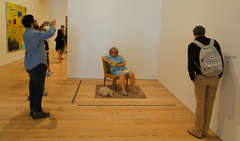
Abruptly in the next room there appears a Duane Hanson sculpture. A super precise plastic model of a grey haired woman sits in a chair, her clothes pointing to a drab existence, her frozen attitude alleviated — in some way — by a sleeping grey haired dog at her feet. The dog’s head points away from the viewer, and thus hidden from sight it tends to aggregate the aura of mild shame or deep indifference that exudes from the piece. Hanson operates at the dead end of portraiture, where realism taunts us with false promises. Instead of the fullness of imagined accuracy — as in, say the photorealist scenes by Richard Estes — we get a depredation of presence and vitality, as the figure returns to its mere figure-hood. Statuary without celebration is the order of our dailiness.
Smack in the middle of a large wall is a large self-portrait by Rudolf Stingel. (The preponderance of self-portraits in the show deserves a separate commentary.) Here a posed photograph — Stingel dressed casually and reclining on a bed staring blankly out at his viewers — is duplicated in black and white oil, featuring nearly invisible strokes and so looking for all the world like the photograph it both copies and obscures. Coming in at approximately ten by 15 feet, the tour de force achieves its mastery both at the level of technique and psychology, for the look of transcendent boredom — or at least measureless distraction — outshines the other self-portraits on display. I recall Pauline Kael’s characterization of Citizen Kane as a “shallow masterpiece.” Here we have it, a casual “selfie” on a grand platform. A photorealist painting that uses an actual photograph: It defies the usual classical balance between hard-won style and popular medium, not to mention surface and depth, and the purity of genres.
Just around the corner from the Stingel, Annette Lemieux assembles 30 photolithographs, each a portrait of a single raised arm. But her presentation, called “Left, Right, Left, Right” is complicated because her medium is brought under a challenge. The 30 arms belong to but ten different people, mostly historical figures and celebrities, and the triplets are over-ridden by the manner of display. Each photograph, roughly ten by 12 inches, is attached to a thin wooden plank, about seven feet tall, which is unceremoniously leaning against the wall. The usual placards carried at a political demonstration are here turned into a universal sign, defiance and assent contained in one of the major gestures of our age. The title suggests the need to march, to hear the order and the urgency in political demonstrations. It takes a certain bravado to include this piece in a show dedicated to portraiture, but the images vividly define and characterize the people being (partially) shown. The classic elements of portraits are in use: a demanding pose, a distinctive style to the sleeves, an implicit background that contextualizes symbolically, all done with inventiveness and an application to the traditional elements. More an installation than a group photograph, this tests the generic limits of portraiture by restoring some of its historical charge.
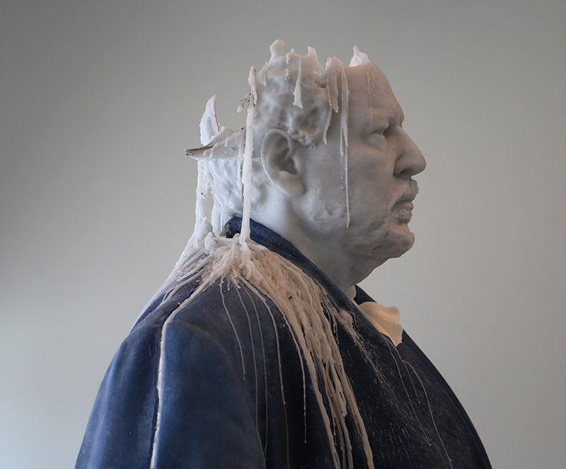
At a far remove from the rather somber Lemieux piece there is the Urs Fischer creation, “Standing Julian” (2015). In some ways the technical show stopper in the exhibit, this is an oversized model of the painter Julian Schnabel. As such it mightn’t stop any show, except it’s made of wax. Every day a wick sticking out of Julian’s large head is ignited and allowed to burn throughout the museum’s opening hours. As the model is eventually reduced in size, Fisher replenishes the wax and remakes our Julian into a pristine artist and lights him up all over again. Does this suggest Schnabel is a figure who never goes away, even though the forces of nature might implacably reduce his stature? Again portraiture seems drawn to satire as its impish shape-shifter.
Much of the remaining floor space is given over to small thematic groupings. The “Price of Fame,” for instance, features celebrity-hood, conjuring the usual figures. Most garish, but in a good way, is Ashley Bickerton’s tryptych self-portrait, the artist reduced to corporate logos. But nearby this group are a number of oddball works, like Charles Ray’s dozen or so photographs of himself wearing all of his clothes, a different outfit for each shot, all in the same sized format and wearing the same style shirt and paints, but with differing colors and patterns. Even odder is the ineluctable Bruce Nauman who offers us “six inches of my knee extended to six feet.” This is a long piece of partial tubing made of polyester resin, modeled on a fixed portion of Nauman’s knee and then repeated until it extends to a total of six feet. The piece is fastened to the wall with its curved area facing out and nothing but the faintest traces of the molding in evidence. As is the usual strategy with Nauman, we are tempted to translate ersatz objects into gnomic questions or equations. Can a portrait amount to little more than a limited impression? Can one extend the inches of one’s knee until they turn into feet? How indistinctive is the cast of one’s knee? Most of Nauman’s body-centered art amounts in the long haul to a self-portrait, eccentrically singularized and yet a subtle and quirky un-defining of the artist’s personality.
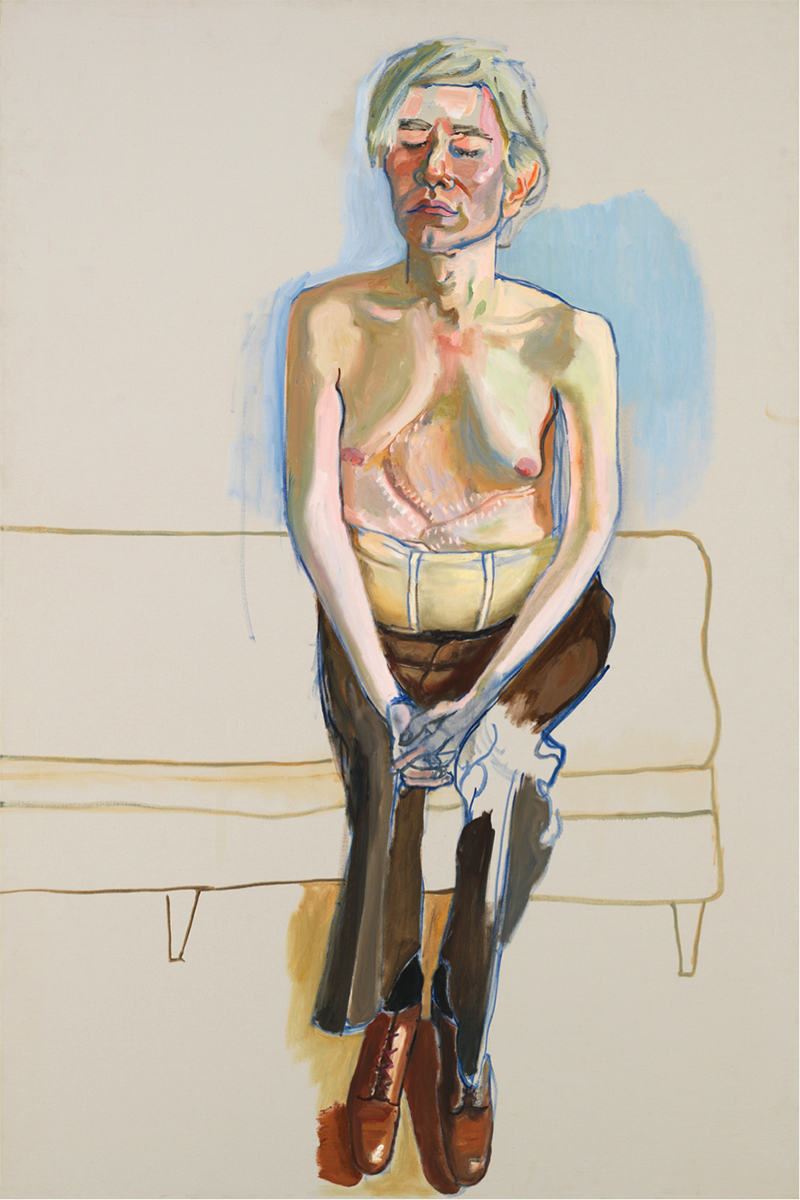
Lacking an official conclusion, the exhibit manages to put up on the wall near the last room one of the iconic portraits of our time: Alice Neel’s “Andy Warhol” (1970). This is the one that shows us Andy seated and stripped to the waist, his head held a bit stiffly, neither defiant nor shy, but displaying the almost kaleidoscopic tableau of his scars, winding across his torso, the result of major surgery necessitated after Valerie Solanas’s assassination attempt. Andy’s eyes are shut in an almost prayerful gesture. Here he is for all to gaze upon, the celebrant of celebrities, now reduced to an appearance. Pose, dress, background, all the elements are there and integrated into a moment, “the fitful tracing of a portal,” as Wallace Stevens put it. Is he the picture of our age, our final face given back to us as a stranger, even to himself?
Contemporary art continues to be so manifold in its interests and meanings that any overview may be a bridge too far. It can hardly be well contained by organized thoughts, yet it remains wedded to significance by way of the enigmatic. And if it has let go of the older forms of beauty it still insists on display and performance as essential human undertakings. As Rauschenberg said of his black paintings, “there’s not much showing, but there’s a lot to look at.” •
