Trebuchets. Oboes. Manhole covers. Labyrinthian playground equipment. Interactive Christmas sweaters. Grocery carts. Pangolins. Fish-slapping bears.
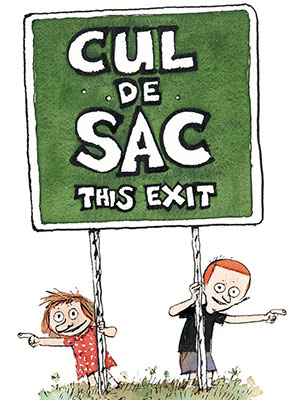
These are just a few of the items that decorate the off-kilter and thoroughly delightful world of Cul de Sac, the comic strip by Richard Thompson (no relation to the guitarist) that ran in newspapers from 2007 to 2012.
Thompson, who died at age 58 in August due to complications from Parkinson’s Disease, wasn’t a household name like Charles Schulz or Bill Watterson. And while successful, Cul de Sac wasn’t a phenomenon along the lines of Garfield or Dilbert. But for those comic connoisseurs who had the opportunity to discover it, it was nothing short of a work of comedic genius.
I also tend to think of it as the last great newspaper comic strip, a final star turn before what had previously been the traditional delivery system for sequential art vanished in a wave of blogs, aggregated content, social media shaming, and unasked-for think pieces.
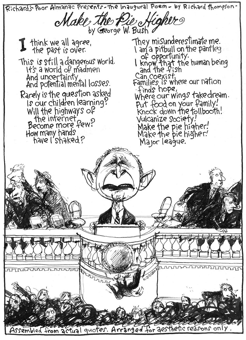
Thompson got his start as a freelance illustrator for The Washington Post, though he also later did art for places like The New Yorker and The Atlantic. But it was at The Post that Thompson, a longtime beltway resident, was most closely associated. It was there, for example, that he began Richard’s Poor Almanack, a weekly strip about whatever topic happened to catch the artist’s fancy at the time, from horoscopes and snow sculptures to imaginary restaurant closings and whatever else reflected the absurdities of modern American life.
(Those with memories that reach back to the early 2000s might remember his most famous strip,“Make the Pie Higher,” a loose amalgamation of George W. Bush malapropisms that Thompson collected into a free-form poem of sorts.)
“It was a free-for-all,” he told me about the strip during a 2008 interview. “They didn’t care what I did too much as long as it was spelled right and free of obscenities and nothing legally actionable with it.”
Eventually, one of Thompson’s editors at The Post suggested he take a stab at creating a family strip, and thus Cul de Sac was born. A weekly, watercolored version ran in The Post for several years (2004-2007) before being picked up by Universal Press Syndicate and turned into a daily.
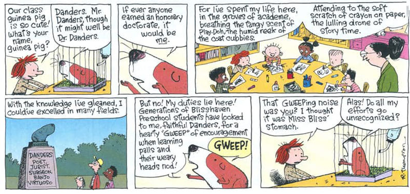
At first glance, Cul de Sac seems indistinguishable from the average (i.e. dull) family gag strip, save, perhaps for Thompson’s rough-hewn art. You’ve got your basic nuclear family, the Otterloop clan (a play on the D.C. outer loop highway): Mom, Dad, immovable object Petey, and unstoppable force Alice. Outside of that, you have the usual supporting cast of colorful characters — Alice’s preschool friends; the preschool teacher, Miss Blisshaven; the school’s pet guinea pig, Mr. Danders, etc.
Once you start digging in, however, you realize this is no average four-panel sitcom. For one thing, there are those names. Blisshaven. Otterloop. Danders. Thompson had a deep gift/fondness for strange words and phrases and incorporated them in into the strip whenever possible (hence the pangolins and trebuchets), giving the strip a healthy sense of the absurd. Cul de Sac teemed with weird objects and concepts — a toy nobody knew how to play with, a compact car so tiny it tips over easily — that pushed the strip right up to the edge of the fantastic without ever truly crossing the line. And while it could be a very verbose strip at times, Cul de Sac never felt like it was drowning in dialogue.
This is most likely because, as with all great comedies, the humor in Cul de Sac arose out of character and not plot contrivances. Alice was the driver of the strip, a perpetual motion machine, either overly excited or terribly vexed about whatever happened to be in front of her at the given moment. Her older brother Petey, meanwhile, was a walking bundle of nerves, fretting about his status on the global pickiness ranking or whatever indignities the natural world might force upon him (his favorite comic book starred a child that did nothing but sit upright in bed). And while — as in Peanuts — Alice and Petey were blessed with a vocabulary that belied their age, their behavior and emotional maturity was identical to real kids their age. Alice and Petey obsessively focused on their own little world and remained unaware of what was going on outside of it.
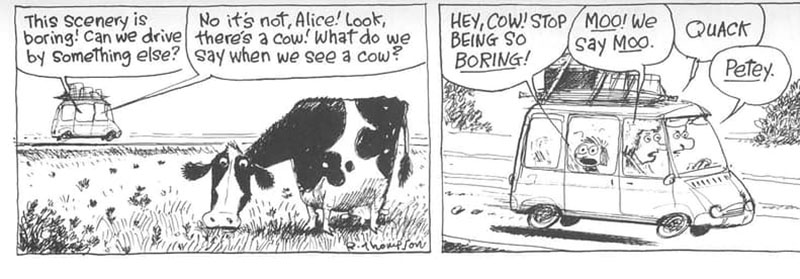 All this was drawn with Thompson’s rough, tightly wound line, an amalgam of Arnold Roth, Ronald Searle, and Charles Schulz. Thompson’s art could appear (emphasis on the word “appear”) messy or chaotic at times but that was kinda the point. At its best, Cul de Sac was a paean to the trivial chaos and ridiculous inanities of modern suburban life, and the art reflected that in everything from Alice’s mussed up hair to the impossibly dense playground equipment. Thompson packed the strip with as much visual and verbal absurdities as the tiny allotted space would allow. An average strip might try to balance two or even three running jokes, only to have the punch line come in out of left field (he was the master of the non sequitur).
But most importantly the strip was funny. Like, in the “sidesplitting laugh-out-loud and share with your friends” category. In an age when most newspaper strips can barely elicit a chuckle when the funnies are filled with legacy strips that have long since passed their sell-by date, Cul de Sac was a smart, sophisticated comic that had a healthy appreciation for the downright silly.
In 2009, Thompson was diagnosed with Parkinson’s Disease. As his illness worsened, he attempted to continue by having artist Stacy Curtis ink his rough sketches. Eventually, even that proved to be too much and he was forced to retire the strip in August 2012. “I’ve gotten too unreliable to produce a daily strip,” he said at the time.
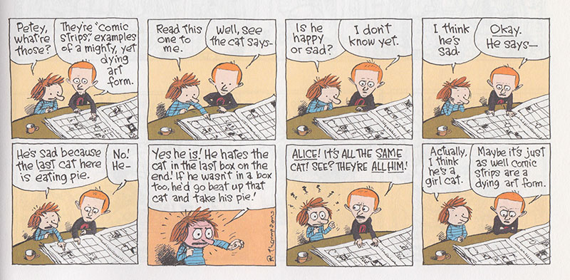
The final strip was a rerun from The Washington Post era. Alice and Petey are looking at the Sunday funnies. Dill is trying to read a strip about a cat but Alice is confused and thinks each panel contains a different cat than sequential images of the same cat. She gets quite vociferous about until Petey explodes in exasperation before muttering, “Maybe it’s just as well that comic strips are a dying art form.”
Comic strips, of course, aren’t dying at all. They live on in various formats on the internet, be they offbeat gag strips or fantasy epics (and often can be more risque and daring than what the average daily paper would allow). However, the newspaper, which for decades upon decades was the premiere delivery system for the art form (at least in America), is seemingly on the verge of irrelevancy. How you feel about this technological transition depends upon your age, compatibility with computers and career choices. Either way, it is a bitter, bitter tragedy that Thompson’s considerable talents should be stolen from him by disease and then claim his life as well. But at least he provided a wonderful swan song for that particular delivery system while he could. •
Images courtesy of the author and Universal Press Syndicate.
