It begins and ends with the line. You start at one point and follow it along to whatever path it takes you, assuming you can find a way out at all. Sometimes the line is precise, authoritative and angular. Other times it is playful, chaotic and ornate. On one page, it is tightly wound and throbs with tension. Elsewhere, it is loose and light, daring you to make shapes out of the white void that surrounds it. Regardless, there is always the line.
The line in question belongs to none other than Saul Steinberg (1914-1999), the noted cartoonist (to paraphrase my friend Tom Spurgeon, I don’t know a better term that encompasses his considerable talents and rich, varied output). Steinberg is probably best known for his various New Yorker covers and illustrations, especially that one of a Manhattan denizen’s view of the world. You know the one.
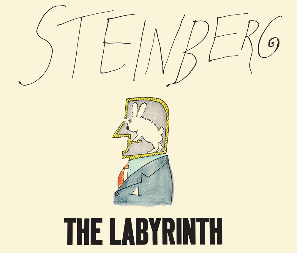
Despite his revered status among certain literary and artistic circles, he’s not someone who comes to mind for a lot of contemporary cartoonists and comics creators (or at least his name isn’t bandied about with any frequency). That might change a bit with the re-release of 1960’s The Labyrinth, a loosely themed collection of sketches and drawings given new life by New York Review Books.
Lest you think I was being metaphorical earlier in my introduction, allow me to tell you that the book, in fact, opens with a straight line (drawn by a rather nonplussed character himself made up of only a few lines) that extends across the page and beyond. At first, it forms a geometric problem, then a cartoonish, two-legged crocodile. As the line continues onward, bisecting the first few pages, it becomes a table, then a railroad bridge, continually shifting vistas and perspective.
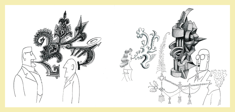
From here the book seems to categorize itself into Steinberg’s various obsessions (or if you want to be gentlemanly about it, areas of interest). So first we have a series of “dialog” sequences, with people seemingly speaking but their words coming out in odd, complex shapes, like florid plants that by their structure reveal the intent if not the literal meaning of their words.
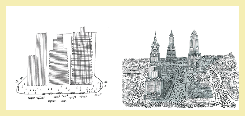
That gives way to a spread of musicians, which in turn leads to painters, people craning their necks in art galleries. Here is a group of unflappable businessmen, there are some Uncle Sams. Over there are the Abraham Lincolns. In this section, we have monuments dedicated to some rather peculiar figures. In that one, it’s urban vistas that sprawl out into squiggles.
At some point (halfway? Two-thirds? It’s honestly a little hard to tell) the book becomes a travel diary of sorts, as Steinberg documents what appears to be a trip to Russia and Eastern Europe. We see empty squares manned by a few rectangle-shaped guards, storefronts that sell paintings and lamps, cramped apartments, and country roads dotted with odd gravestones.
Steinberg’s key trick here and the reason why his work is so striking is his seemingly instinctive ability to focus on the odd and particular details while leaving out everything that doesn’t matter. A street scene might draw your eye to a person’s hat, or a character’s exaggerated posture, or a poster on the wall, while keeping the rest of the page as open and blank as possible. Designers today like to talk about “good use of white space” but Steinberg understood this concept better and more profoundly than his predecessors.
Perhaps the thing that defines Steinberg more than anything is his sense of play. Take, for example, the manner in which he constantly turned words and language into visual objects. A man contemplatively holding a question mark. The word “help” perilously falling off the edge of a pier. A lanky, mobile “yes” coming up against a brick-like, thick “no.” This is not a text as we traditionally think of in comics, even when considering the sound effects and onomatopoeia that dot superhero comics. Words gain a concrete heft in Steinberg’s world but in service to a simple idea or even straight-up gag. Sometimes the joke is elusive and ethereal — known perhaps only to Steinberg himself — but it is always clear to the reader that the joke is there. You might just not be getting the subtext.
The Labyrinth features Steinberg at his best and is an excellent introduction to his work if you’ve managed to somehow avoid it up until this moment. He was not as savage as contemporaries like Ralph Steadman or as dark and unsettling as Edward Gorey. He was critical but rarely caustic, often more bemused and curious at the world around him and where his ideas lead (which was often extraordinary places). He was the constant outside observer, a European immigrant that refused to stay in the fine art world or illustration world or cartooning world or confine himself to one medium but ensure that he straddled as many borders as possible. That was his line. •


