I think the difference between
Thom Mayne
architecture and the other arts
is your immersion in reality.
The beginning of my misadventure was when I first saw Dan Hoffman, the head of Cranbrook Academy of Art’s Architecture department and a visiting professor at the University of Michigan, where I attended, in an absurdly wrinkled, blinding white oxford shirt. So purposefully wrinkled was this shirt that, to my unsophisticated Flint, Michigan sensibility, I thought it had to be a New York fashion statement. Hoffman was a reigning star in the design world and had followed in the footsteps of the enigmatic Daniel Libeskind, who had been the head of Cranbrook’s architecture department when Hoffman had been a student there a few years earlier. Libeskind would become a lodestar for me in my hazy, burgeoning and impressionable architectural consciousness when I discovered his cryptic, indecipherable drawings. I too wanted to create such drawings, and his work would become a cause for my own pursuit, a rallying cry, which would eventually become for me a treacherous tipping point.
Chaos was in the air. The world was changing as if overnight. It was the end of the Cold War, the Berlin Wall had just come down. Nicolai Ceausescu had been deposed, tried amid dramatic fanfare, and executed. The Tiananmen Square protests and massacre had shocked us. The geopolitical changes in the air made an appeal to some of us to push ourselves, perhaps recklessly. In Hoffman’s Cranbrook studio, which we had made a pilgrimage to in the first semester, I saw this all intoxicatingly laid out before me. Hoffman’s grad students worked in one of Eliel Saarinen’s pristine, prewar industrial buildings that had been divided equally into long, narrow studio spaces within which they were investigating process: welding steel, pouring concrete, framing walls, and projecting images onto those walls amid splayed paperback copies of Merleau-Ponty, Husserl, and Heidegger. In one of the stations, there were replicas of Leonardo DaVinci’s machines which one of them was carefully crafting in wood—though the flying machines and contraptions had only ever been ideas in Leonardo’s fertile mind. I walked through the Cranbrook studios, silent, agog, taking it all in.
There was talk of experimentation that semester at Michigan, and much of it was inspired from talk about process. We were encouraged to root around and make discoveries. We were to immerse ourselves in our projects, and any and all manner of experimentation should be a key to the process. This was the journey that would take you down the path — you may not know where you were going, but you were going to get somewhere. Act first, think later, seemed to be the mode. It was as if we could simply produce a mass amount of work and present our findings in the jury to reveal our unique discoveries and how we had tapped our inner Leonardos.
In the years before I arrived at the University of Michigan architecture school, the professors were made up of retired professionals and, apparently, jaded middle-aged practitioners, a conservative mix of classicists and modernists, vehement in their resistance to progressive thought. Now, several of our new professors — often no more than ten years older than us — had come from Cranbrook and the Ivy League architecture programs. In these schools, the cutting-edge design set the standard that the other schools soon followed. The new professors were challenging the tenured old guard at Michigan and stirring us up with their infectious passion. We were all on the cusp of the new — we were all looking for it in the latest exciting happenings in architecture. That afternoon, in his fashionable shirt, Hoffman stood before a critique space packed with eager students and caused a hush to go around any time he scratched his head and paused over a thought he was about to conjure into the ether.

As Hoffman was now a visiting professor at Michigan for a group of graduate students, one afternoon our professor suggested we go look in on his studio. Several of us ambled through the palpable concrete dust expecting the intense gaze of these advanced folks (they always seemed physically larger) who were breaking rules and on the verge of changing the world. As undergrads, also known as Professional Year Ones, or PY-ones, we didn’t usually, casually interact with grad students. I recall them as wise elders infiltrating the studios sporting their black turtleneck sweaters and designer jeans. Several were Austrian exchange students whom I noticed because they seemed to have money and impeccable sartorial taste, adding antique eyeglasses and patent leather shoes into their fashionable wardrobe. They hardly gave us PY-ones a glance. But Hoffman’s graduate studio was nearly empty as we passed through. As if they had bought into the romance of the all-nighter work sessions that were de rigueur in architecture school lore.
Evidence of their work was casually strewn about the studio. With tables pushed aside, Hoffman’s grads had been pouring concrete into complicated wood framed fabric molds in the attempt to see how concrete . . . set in fabric molds? Whatever we thought, Hoffman’s work was an investigation, and results came through serendipity, and ineffable discovery in the possibilities inherent in materials. It didn’t initially make sense to ferret out a form in the liquidity of material under atypical constraints, but we also couldn’t stop discussing it, long after.
•
When I started architecture school in 1988, the profession was in the first flush and romance with deconstruction. (It is sometimes now referred to as Deconstructivism, but at the time, we called it Deconstruction.) It was all the rage, as if it too, had arrived overnight. Deconstruction was not so much a theoretical practice in architecture as an excuse for a reformulation of the language of architecture, as well as a possibly misapplied term to architectural discourse. Ignoring for a moment any actual theory that the philosophy invoked, for many architectural students the idea was no more than the zeitgeist, the latest trend, utilizing language that seemed ready-made to apply to architecture.
Deconstruction arrived as the post-modernism that had been prominent in architecture for the previous decade and a half, seemed on its last legs. Deconstruction was essentially a European movement, in reaction to the conservative drift in design embodied in the stateside work of architects such as Philip Johnson, Michael Graves, and Robert A.M. Stern. It had been bred in the avant-garde of Austrian architecture, through the work of Coop Himmelb(l)au. Deconstruction was also a reaction against the excesses of postmodernism’s veneer of slickness. Postmodernism was an aberration many of us were eager to subvert, what had used a pastiche of historicity to produce a superficial look, and never involved a viable theory, after all.
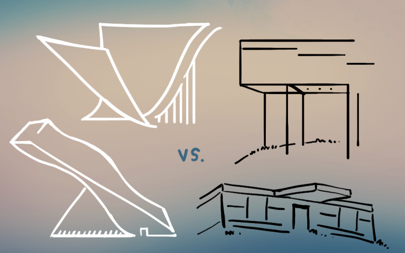
There were numerous theoretical camps being touted in the fashionable architecture presses, movements which had stood for years on their own in striking contrast to the trend of deconstruction. The Harvard Graduate School of Design, and Yale’s architecture programs set the tone in their timely monographs. The common denominator of them all was a critical and cultured approach to the craft of drawing, something I had excelled in, and so was eager to explore.
An Austrian grad student I had befriended from Gunnar Birkerts’s studio had introduced me to Christopher Alexander’s A Pattern Language, a set of intentionally anachronistic looking texts laying out the precepts of timeless design. The Pattern Language people came by way of Berkeley, where Alexander taught, and they used simple and practical common sense to make comfortable, useful and aesthetically pleasing craftsman spaces, though these designs were often unremarkable.
There were rationalists of the postmodern Italian new wave and followers of architect Aldo Rossi, whose books, A Scientific Autobiography, and Architecture and the City were considered bibles. Rossi had not only obsessively drawn his work, but he had also seen much of it built. On a grand scale. He would even return to the buildings themselves and sketch alternative versions, to revisit and reinvest the ideas that he had originally conceived for them. In this way, he had transformed his own work into iconography. A Scientific Autobiography was a manifesto and personal mythology of his life’s work.
Rossi’s work was an extension of Italian rationalism or neo-rationalism, and it was bold and geometric, and, theoretically at least, embodying functionless spaces. The idea being that architectural spaces were universal and could be ascribed function out of necessity, rather than limiting them to one preordained use; buildings tend to outlive the people who build them, Rossi implied. Rossi was creating buildings that would make ideal ruins. The bold formal plan, the cylinder and obelisk, the eminent, symmetric façade, seem composed to have an effect on the psyche. Constructed of concrete, masonry, and expressed steel beams and columns, his scribbled sketches and drawings, in sharp black pen and ink with washes of watercolor and pastel, were sentimental, comprised of religious and historic figures, statuary and narrative, and graphically delectable. Rossi infused in the drawings his personal view of the history of architecture and lent a design the inevitability of destiny. In his San Cataldo cemetery design, Rossi based his perspective rendering on the form of his own body laid out after a car accident. I had taken Rossi’s monograph with me on a trip to Europe a year before I began architecture school, hoping to mimic his style.
John Hejduk, an architect who rarely built — and whom Dan Hoffman had studied under — was a mysterious figure who was the reigning dean of The Cooper Union, an elite New York City architecture school that I had applied to a year before. His work existed mostly on paper, in poetic writings, and drawings in his monograph, Mask of Medusa, about an alternative, somehow shadowy and dreamlike architectural world.
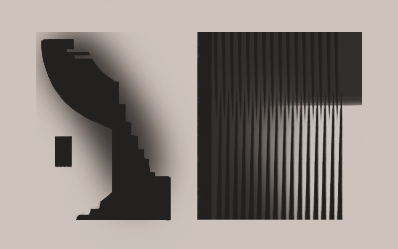
Bernard Tschumi’s Manhattan Transcripts were another example of the graphic invigoration of architecture that had become an essential reference for deconstruction. His drawings were presented as movie stills as if for a stop motion architecture, creating a narrative of the program. The cinematic reference was a bold attempt to associate the two disciplines, and yet the approach was original. His massive and widely touted project for
the Parc de la Villette competition outside of Paris was to be the embodiment of his ideas in a key work of deconstruction; Tschumi had even consulted with Jacques Derrida — the originator of deconstruction — in its design.
Deconstruction, as it was originally conceived (around 1967) as a movement in literary criticism with roots in Post-structuralism, can seem to be nearly impossible to define. Derrida, when talking or writing about it, seemed to engage in the elusive explication of all that deconstruction was not. Where would this have left those eager to embrace the new thing that had, initially, little or nothing to do with architecture?
If one were to take it on face value, nothing about the term — as applied to
architecture — has anything to do with “undoing” construction, though in a sense, to look at some of the work, you might be forgiven for thinking so. And so, this may have been, at the very least, what many thought Deconstruction was, as applied to architecture.
Deconstruction translated into building became manifest in a sense of disorder. What is often noted are the jumbling of planes, the collision and subsuming of forms within other forms. Quite literally, as if the structure is coming undone, being dismantled. This aesthetic could have come right from drawing.
Deconstruction via the training of architects most likely skipped across the
surface of the theory. It perhaps became as much about the look of a design, an aesthetic — in the same way, classicism was to Post-modernism — as it was a theory. Deconstruction became expressed through the figurative language of architecture in gestures: the apparently controlled disorder in the shards, lines, and forms that were components of the drawings. None of these emblems could essentially be considered as part of having defined the movement, but rather it was apparent in the residue of the work coming out of the vanguard. This indefinable grey zone of meanings, misinterpretations and cross purposes about deconstruction might be problematic for purists. This, however, is the movement itself; all popular movements become pale facsimiles of their original inspiration.
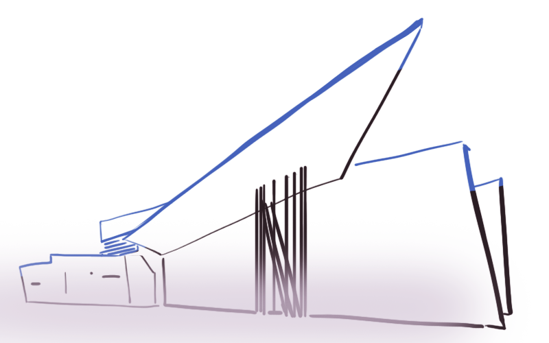
The theory aspect of this application was intoxicating and crept into our discussions. It was inescapable. Drawings were taking on an appearance that suggested deconstruction, in theory, a kind of violent result, what skewed far from the orderly representation of wall, plane, and plan. This was becoming the popular norm. One could see it in the work of Coop Himmelb(l)au, in the free form, impressionistic sketch for their Red Angel bar in Vienna, and in Zaha Hadid’s design for the Vitra fire station (which proved the outmoded criterion of function when, years later, it was turned into a showroom).
We were reading the requisite philosophical texts, selectively, possibly misinterpreting Derrida’s Margins of Philosophy and his book on Husserl, Origin of Geometry; Michel Foucault’s History of Sexuality, or any contemporary philosophy text that was likely to have crossed Hoffman’s desk. We hyperventilated over Walter Benjamin’s “The Work of Art in the Age of Mechanical Reproduction,” which questioned authorial authenticity. Benjamin had written this essay during the pre-World War II post-industrial rise of socialism and was making a commentary on how industrial production could redefine what constituted art. I wasn’t sure anyone was reading an entire book, let alone making sense enough to apply it to their practice — I know I wasn’t. Though a fellow student told me an influential undergraduate professor had advised him he should be reading 1000 pages of theory a week — a goal only imaginable for someone eager to stand out.
Like most students at the time, I suspected, I did not have a firm grasp on any one theory enough to apply it to design, so I was initially resistant. Though of course, I was all consumed by the idea that theory lay behind the work. To add to the confusion, I was not interested in simplifying a building down to its functions. Function was a boring reduction of possibility, I had rationalized from my reading of Rossi; therefore, it really had no point in the design. For that matter, I did not consider designing something to be built, which is, of course, the point of studying architecture. There was a veering away for me, where theory and reality ceased to coincide.
I assimilated conflicting influences because I was eager to produce work that would stand out. My acquaintances and I all struggled to achieve our personal visions. At the end of a project, when one stood up to make their presentation, they had tried to be a pitchman, using the latest philosophy lingo and flourishes to disguise that no amount of theory could really deny or bolster the physical evidence of the drawing before them. It made it more appealing, however ambiguous, to spice the discussion with theory language for emphasis: void, figure, absence, aporia, and limn, among others. Although it was by then clearly part of our consciousness, visiting professors were constantly trying to enlighten us, invoking the history of Dada, the fur-lined teacup, the “marriage of a dissection table and a sewing machine,” of Fluxus, the imagery of Magritte, and Surrealism. Experimental filmmakers’ work seemed ready to appeal to architects, and our enlightened professors had talked up, and eventually, screened for us, The Cabinet of Dr. Caligari and Chris Marker’s La Jetée. At some point, I had even been seduced by the craft of artists Walter Pichler and Joseph Beuys, whose minimal, almost primitive drawings inspired me with the possibility of using found objects, scrap materials, and formwork. These influences all tied together into the broad and confusing discourse of architecture which became inseparable from crafting art that made a reference to the world through its possibility as architecture. The seductive appeal of drawings opened a door.
I might have hated postmodernism and what it represented, though I had also been inspired by Rossi, who on the look of it, could have been classified as a postmodernist. I rationalized the promiscuity of references, by touting the craft of architecture, which would lead naturally from the craft of drawing. For all its current cachet, drawing had lost some of its power next to the overly technologically biased computer-aided drawing practice. However, computer technology was still a new and untested field for building, and thus, the unexplored potential began to inform manually drawn representations of architecture. Which is where my abeyance to drawing came in. I would eventually get caught up in the visual language that was often deconstruction’s most compelling aspect.
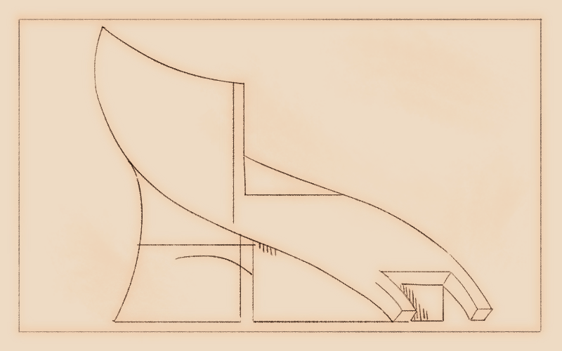
I wanted to create mechanically perfect drawings with the warmth of human drawing as if to blur the lines and comment on the technology available with computer-aided drafting. Of course, I was proud to have not set foot in the computer lab.
•
“When the once-potent truth of architecture is reduced to a sign of its absence, one experiences a parching, suffocating dryness: ‘The psyche lusts to be wet.’”
So goes the epigraph that accompanies Libeskind’s 1983 Chamber Works: Architectural Meditations on Themes from Heraclitus. Libeskind’s drawings were indistinguishable as architecture but functioned as a symbolic manifestation of architecture. A reference of possibility. And, somehow, they were never described as anything less than architecture, which pleased me. Libeskind even claimed that he was not an architect. To me, he was a graphical genius, an artist of the first order. His Micromegas and Chamber Works suggest three-dimensional space through a hyperactive and ultra-intensive manipulation of drawn, two-dimensional space. The drawings resembled the scrambled inner workings of an incredibly complex piece of electrical equipment, with narrow, long curving fragments, hints of perspectival walls, and bending columns. Dashed lines, crosses and curved walls, are lesser elements which catch the eye for their scarcity. The drawings are beautiful. As a nod to the rigor of his theoretical approach, Libeskind had proposed void spaces in one of his eventual built works — symbolic of the 20th century’s consciousness of Nazi horrors’ past, a kind of #MeToo moment for architecture — for the Berlin Holocaust Museum competition for which he had won the design.
Chamber Works were composed of a series of 28 drawings that seemed to
represent an alternative space that evolved from figure to line, from a horizontal orientation to the vertical. According to his website, Libeskind was a violin prodigy, and the drawings worked out of concepts related to music and mathematics. Heraclitus’s writings — written in the 6th century B.C. and providing a textual mnemonic for Libeskind’s work — were highly aphoristic with a primitive emphasis on the elemental: fire, earth, and air. They were about perpetual change and flux. After poring over this fantastical work, I read Libeskind’s accompanying text and the cryptic language was, to my reading and interpretation of it, almost romantic, pseudo mythology. I managed to make sense of it.
Never mind architecture, or theory for that matter. I was seduced by the
drawings, by the sleight of hand that convinced me that this was another, truer, form of architecture.
Thus, I began my own attempts at creating three-dimensional, impossible architectural spaces in two-dimensional drawings. Essentially, representations. Here was a contradiction in my work, and the beautiful disconnect that should have been negotiable, I thought: I didn’t want to represent anything.
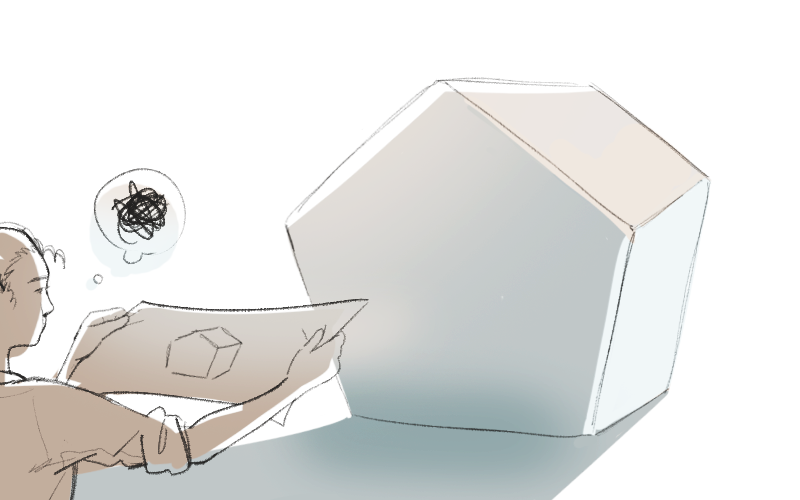
Building models could be an intriguing exercise but drawing left more to the imagination. I often worked back and forth between the two disciplines, attempting to interpret the abstraction of a drawing into a built model, or vice versa. I wanted to challenge the limits of three-dimensional space — a far-fetched, if not impossible, goal by questioning the assumptions inherent in architecture, which seemed to me what Libeskind was also doing. Buildable architecture had limitations. I had no confidence that what I was drawing was buildable. If there was any attempt to design a functional object, it would be something useless (the self-righting machine, the voyeur machine) and based on fiction.
•
After three semesters of this, I had produced some involved work that sent me on occasionally futile tangents, and I had never come close to designing a building. The results often caused my instructors to openly question my fitness for a professional degree. I had achieved, for myself, I thought, a high level, and I expected to maintain it; but maintaining it was debilitating. The pressure was high on me for what I expected of myself, but the pressure was higher on me as much for what I thought was expected of me. Working at the studios began to make me anxious, filled with doubt about my work. As time went on, I had found distractions outside of school as a means of escape. When most of the students were hard at work on their design projects, I had taken to sitting outside on the main campus reading fiction, avoiding the studios for hours at a time. Turning my back on architecture was having disastrous effects on my other course work,
where I had stopped finishing assignments and was in danger of not graduating. As well, my health suffered.
My final semester would prove an insurmountable task. For a while, I had been mentally checked out, coveting the laurels of a few hard-won achievements from prior semesters, though such few did not constitute a degree. I had all but stopped producing.
I could not assess my progress, and so tried to avoid recognizing that I had
worked my way into a corner. Some semesters were marginally more successful than others, though to acknowledge that most of the time I was barely getting by was an understatement. It was hard to believe in the work I was producing when I knew it ran so counter to fulfilling the assignment. This helped explain why, the previous semester, I had walked out of a jury before I could take part in a group presentation and, fearing the repercussions, broke down in tears and anguish, feeling a fraud.
My sense in looking back is that, over the semesters and a series of projects, I had slowly lost touch with reality.
Amid all of this, I did have a few returns to the work where lost in drawing, I would spend hours within those complicated lines without quite grasping where I was going with it.
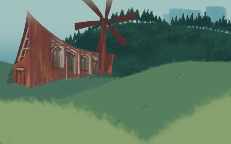
For my tall building studio with Kent Kleinman, another impeccable craftsman of drawing, I made an initial effort to conceive of spaces for such characters as the watchmaker, the calculator, the timekeeper, the custodian, though again, as if in some alternative world. I fully intended to investigate the design of a windmill brewery for one person. It was to be fashioned of deep earth wood pilings and formwork and would sit in the hilly woods on the edge of campus. An archaic, hand-hewn space of timber and uselessness, like a child’s treehouse taken to the next level. Somewhere within the drawing stage, I got bogged down in the concept, and never looked up.
After spending an entire afternoon carefully delineating one of these drawings on manila paper, I was so full of what I had drawn that I marched around the studio to show it to anyone curious. I had been working diligently in graphite and was looking for confirmation and approbation. The looks on so many people’s faces told me they were bewildered by my hubris and probably questioning my well-being. Ultimately, the tall building studio drawings, almost all of them incomplete, resembled little of an actual practical design for a building. I had gone so far into the belief that I was challenging the entire premise of the architecture school that I ceased to be part of it. I had become so confused in the pursuit of abstract and falsely motivated ideals that I had turned my back on the purpose of my degree.
At the tall building studio critique, I had my reckoning. I faced the humiliation of my tepid production. Because I had not faithfully worked on a building that semester, I acknowledged aloud that I had “let myself down.” On the other hand, I argued, I had tried to adhere to the process, presenting my findings. I claimed the virtues of paper space and held up non-building architects as my precedents. It was a futile performance. A professor on the jury scolded me, “You didn’t let yourself up.”
That intensity of architecture school is built into the mythology of the long hours of work into the late-night; you are expected to suffer to get through it. But is it any wonder, under the conditions, that the various degrees of suffering might all look similar? It’s a boot camp mentality. For me, it began well with me feeling for the first time in my life like I was part of a select group, and I enjoyed belonging. Though we all probably suffered through it in our own ways, who was I to feel slighted when no one applauded my work? In fact, though I wanted to be someone who produced this work that I admired — and a few had acknowledged it — I took it on almost as an entitlement.
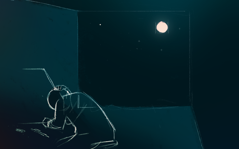
I believe the clinical name for this is suffering under delusions of grandeur.
Though the phrase has lost some of its heft for being so widely thrown around, I don’t mean it to be tongue in cheek. For me, at some point, natural ability in this highly competitive program pitted me against a few superior students, and under that pressure, I could only see that I had to try to outdo everyone else. This was unrealistic and an outright foolish delusion. I wanted attention and strived mightily to get it. Thus, I could “never let myself up” in the words of the jurist.
When I look at Libeskind’s drawings now, I can understand the impulse to think: who could have drawn those and maintained their sanity?
In fact, Libeskind’s drawings are the epitome of dedication to craft, to the
production of an ideal that is assured of its conviction, and process. He couldn’t have done them without being one hundred percent coherent and present.
I still have the artifact of my own drawings, which I am rightly or wrongly, proud of. These drawings are confounding, though I can recognize the skill in them. It is just that, ultimately, they don’t mean anything.
In looking back at my self during those years, I recall that I was that young man, and I have tried to be generous toward him. He felt like a fool some days, a mad man on others, and even an utter failure at times, and had no capacity to know any of it was playing with fire. Or perhaps, that was the point then, to play with fire, the only thing that mattered. Is this a cautionary tale? I was surrounded by so much influential brilliance and perhaps saw a capacity within myself to take part in it, to offer my contribution. At some point, it was all that I could see, all that I wanted, though I didn’t attempt to take the actual, rigorous path there. It’s not hard for me to see why the Icarus myth has always been a kind of functioning reminder of how hubris can destroy initial good intentions, and it’s a tale I am fond of using now in reference to this younger self. I would like to think I would know how to reach that 23-year-old. I wish I could have told him then, life’s not a competition, have fun for God’s sake, look around a bit more and try not to only see yourself in all that you behold.
•
Prior to that last, disastrous semester, and after the winter break, was the annual, school-wide, Raoul Wallenberg Memorial Competition, a design to memorialize the recent fall of the Berlin Wall. It was somehow, for me, one moment of defining clarity. With this project, I came up with the synthesis of my formwork infatuation. I had devised a series of large kiosks, uninhabitable structures that would be located along the path of the former Berlin wall, made of formwork and old timbers. The gaps in the formwork would allow someone to see into the interior space of the kiosk, wherein there would be informative text about the history of the Berlin wall, even hunks of rubble from the wall. The design was purely temporary, but its intention of poetics and political commentary could be subtle and effective. The kiosks would be untended, and would naturally deteriorate over time, unlike the concrete wall. I didn’t imagine that my design was intended to be useful, per se, but such was the area I think I recognized I excelled in, conceptual design. The essence of my project was to question the idea of unity in a place that had ushered in World War II, and its potential ambiguous and ambivalent reckoning with that history over time. I called my proposal “Unity”. My text for that design read:
The follies become historical markers. As with the wall, in time the information found within will wear away, at which time the kiosks will be set afire, leaving the rubble of the walls . . . One for each year the wall was up. By allowing the dispersion of these structures, this will call into question any achieved ‘unity.’ I.e., when it is determined that these follies have become a nuisance, it will require some governmental unity to see that they are destroyed. As it is, the country will remain symbolically split until action.
My cohort was right there beside me. We had been sitting in a row when Helmut Jahn, a prominent postmodern architect who had been the guest judge — and, as I recalled, he had even graced the cover of GQ magazine a few years earlier — announced the winner and runners up to the packed auditorium. I can see his designer shirt, and how the collar was cut to unusual points on the lapel. My head roared when my name was announced. Numbly, I stood up and made my way down the steps of the auditorium to applause, my head filling with the rushing blood of excitement and terror. I really thought I was going to pass out, though I was so enthused by the recognition that I knew I had to keep it together. I shook his hand. With uncharacteristic levity, and daring, I asked him, “Who is your designer?” Helmut Jahn said, “Montana.” Then he added, “Not the quarterback!” I did not win, but I had earned an honorable mention, which, though that meager title rankled then — Shouldn’t I have won? (an indicator of where I was in my head)—it was a partial vindication of my process and a short-lived victory for my efforts. It said to all the people who had questioned my approach that I could produce the work, at least for a few hours, or days, or weeks. I had designed something that could be built, that was, essentially, architecture, and yet was highly conceptual. Walking out of the auditorium that day (which also happened to be my birthday), I was on a joyous cloud, caught in the moment, with no thought about the future and little plan for what would come next. •
