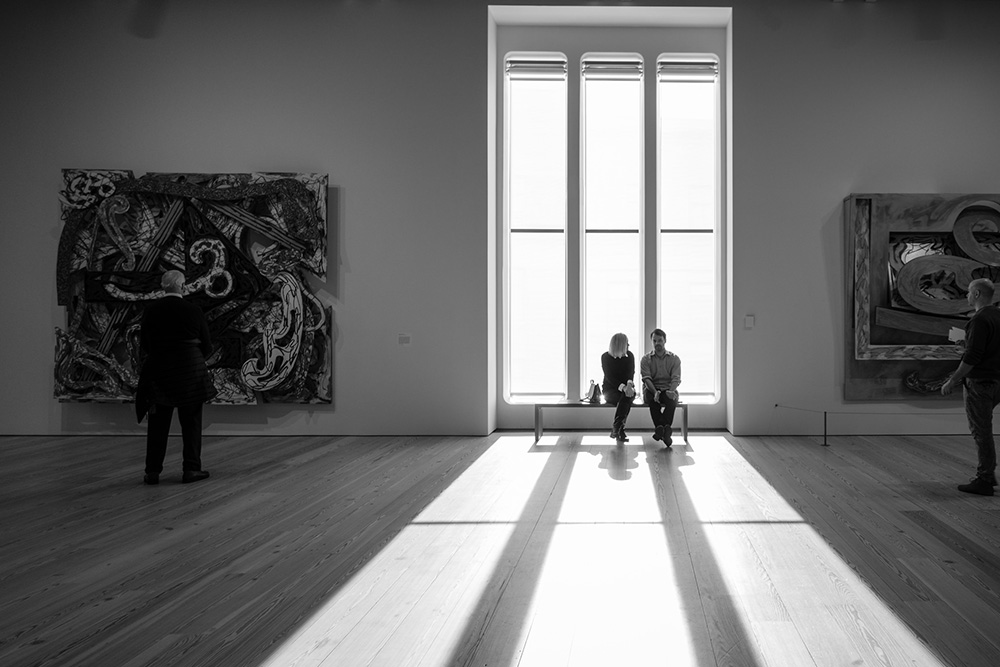


The Whitney Biennial, which was inaugurated in 1932, once again works by promising us what is new, challenging, and — with luck — of lasting interest. The promise involves finding the right frame and purpose, such as scientists find in the use of a cross-section. Slice into contemporary art and lay out what most rivets, without fear or favor, label it, study its energies, and try to bear accurate account of what it’s made of. Then it’s reviewed and talked about and disputed — a cross section of a cross section. A two-year survey of what is an impossibly various assortment of works and practitioners of the visual and plastic arts, from the jackanapes to the genius, from the ravishing object to the puzzling proposal. It can’t be taken in; it will be taken in.
This year’s version runs from mid-March to June 11th. Delayed a year and a half because of the opening of the museum’s downtown building, this biennial starts a new run, lulling us into memories of the previous shows and yet promising a new place where the art is somehow still aborning. Recovering from this small interruption of its run of 73 yearly or bi-yearly shows, the Whitney looks to make the 2017 issue an especially memorable one. As Jason Farago put it in The New York Times:
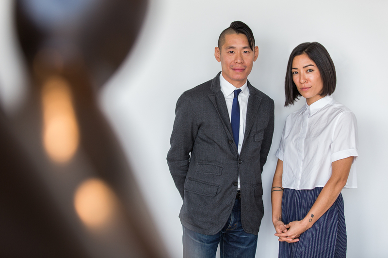
In a generational shift, the Whitney has chosen two young curators for this always anticipated exhibition: Christopher Y. Lew, 36, and Mia Locks, 34. It’s also the first time that the biennial’s curators are both people of color. After months on the road, they have boiled down the art of the last few years into a survey that, for all its energy, doesn’t overwhelm the museum.
The last phrase here suggests that a bit of tempering optimism might be in order. But it has always been so for this cultural event. This year may be different. Besides the two curators, the survey selected 63 artists, which includes a high percentage of women artists and a large amount of work devoted to social and political issues. (In 2004 more than a hundred artists were selected.) All of the artists on this side of the generational divide appear fearless, though as yet untested by the market, a large portion of the public, or the academy. The Biennial always proceeds riven with tension between its choice of diverse or representative individuals, and the importance and cohesion of its theme. Apparently, the 2017 version has chosen to face up to the call for thematic coherence, which it singles out as its concern with the “formation of self and the individual’s place in a turbulent society.” The theme is self and society; the articulation relies on the diversity of the artists and their work.
How might one take an even-handed cross-section of the show? The museum, for its part, says there are “featured artists [that] vary in their race, gender, sexual orientation and geographic locations . . . [and] there are nearly as many women as men; a large delegation from California; and several from outside the continental United States. They work in various media, including technology.” In case you might wonder what besides technology is included, the work ranges “from emerging to well-established individuals and collectives working in painting, sculpture, drawing, installation, film and video, photography, activism, performance, music, and video game design.” With all the specifications in place, the Biennial was ready to be judged and debated. At the press preview the director, Adam Weinberg, seemed eager to start, declaring that he expected it to be “divisive and tumultuous.”
Plotting the Field
I saw the Biennial as comprising three rough-hewn categories. First came the more-or-less traditional use of the canvas painting and its near cousin, the large photographic print. Then, the obviously social and political works, more like statements than expressive gestures. Last, but far from least, large-scale installation works that use different media without any apparent concern for genre or harmony or structural finesse.
The first group was made up of those fearless artists who still take brush to canvas. This is by now a loose enough commitment that it can easily accommodate inkjet prints and other photo-based works. Most engaging to my eye was the room singly devoted to Aliza Nisenbaum (b. 1977), containing five canvases. These included separate genre compositions: a still life, an informal group, two group portraits, and a trompe l’oeil. The work stands out for its skill, even its inventiveness. But it inescapably raises the question, why go on with anything like traditional painting? Especially when all your fellow artists scattered here about seem intent on doing something quite different.
Three other female painters work in veins not so distinct from Nisenbaum and do so with her level of interest and skill. Take Shara Hughes (b. 1981) who has brought forth six large canvases with bright colors and bold, free strokes. Her subjects are suspended between figuration and abstraction. Her shameless strokes seem like excuses for her colors, even as her colors demand to be opened up with forceful strokes. Another woman, An-My Lë, uses ink-jet photographs to record scenes in and around New Orleans, where she now lives, though she was born in Saigon. Our collective memories of the Vietnam landscape work as distant images, landmarked by marshes and poverty and under-development. The places of the photographs are silently present, and their not-quite-mirror images are fugitive. In each case, place becomes destiny.
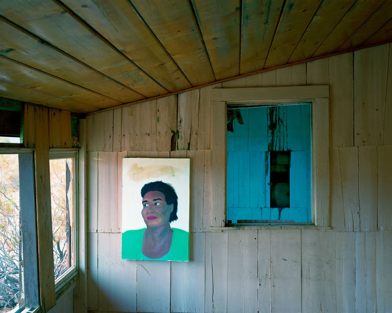
John Divola (b. 1949) shares a medium — the ink-jet print — with An-My Lë, and also echoes her theme. Using abandoned buildings as his stage, so to speak, Divola hangs a small painting on the wall of each of eight buildings, creating a juxtaposition of scale and texture as a way of fixing a sense of place. The loosely rendered paintings are portraits reminiscent of earlier work by Laura Owens. The final effect borders on sentimentality, a feeling that is concentrated by the sameness of each print. In a somewhat similar way, Celeste Dupuy-Spenser displays paintings that recall some of the effects of Aliza Nisenbaum. With a taste for graphic invention in different styles, Dupuy-Spenser enjoys a room of her own (as happens with others in the show) and fills it with 18 paintings and drawings, most of them showing an indebtedness to the use of cartoon styling, though done with an appreciable rigor. Some of the smallish paintings are hung in two clusters; the remaining larger canvases are quite traditional. In one of the clusters, however, is a cartoon-like ink drawing that stands out as an obvious expression of anti-Trump sentiment, as three hooded Klansmen stand in the background.
Three artists are aggressively activist, and their work varies one from the other. The most overbearing, but in a good way, is an installation that adorns two sections of wall at right angles to each other. One wall has been stripped open to reveal a number of objects that are tied severally to artists, all of whom are in debt. Black Rock seems to hold the IOUs of many of those represented. The wall and its uncovering is the work of a collective, Occupy Museums, first formed in 2011, made up of five artists. One object of the painting is Black Rock investment and the activity it exposes in terms of capital’s predatory and sinister nature recall the work of Hans Haacke.
The second socially conscious piece is comprised of paper records of correspondence and official business, making it a more modest piece than that of Occupy Museums, but just as politically pointed. Cameron Roland has arranged for the Whitney itself to purchase a $25,000 bond, known as a “social impact” investment. The Museum in effect puts its capital at risk based on the recidivism rate in a New York prison. The prisoners, for their part, will earn a profit for the Museum if they do not return to jail. The entire scheme, as I understand it, shows how inhumane the labor done by inmates is at less than the minimum wage. The documentation of the legal contracts involved in the bond make up the physical part of the work. The conceptual part is rigorous and often hard to take in as language.
The third very obvious political work is a roomful of similar panels, each simply reproducing, in printed form as if by Xeroxing, with hand painted under linings and marginalia, the pages of a book: Censorship Now!!. The book’s author, Ian F. Svenonius, shouts out his polemical message. The artist, Frances Stark (b. 1967), has shouted it out, so to speak. Here is a very condensed form of the gist of the argument:
In the existential void created by the money god, any sort of punishment seems preferable to the asinine free/not free purgatory to which we are assigned. [We need censorship] to stomp out grotesque subliminal mind control and hate speech of modern culture, media, news, politics and art.
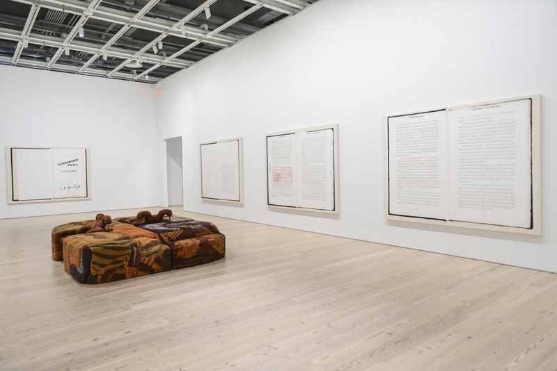
Some will recognize here an upside down version of “repressive tolerance,” made famous some time ago by Marcuse’s One Dimensional Man. Nothing is more controlling than the false belief that we are free. The panels, each identical in size and format, run around all four walls of the room. The medium of the work mocks the reliance on screens in the internet world; here we are returned to the argument by text, solid, uniform, and too big to ignore. But the argument can be taken seriously — after a fashion.
The most eye-catching work in the exhibition is not only a wall-sized object, but in fact is one of the museum’s walls, fashioned of glass windows, but here replaced with 18 panes of brightly painted acetate sheets. These large acetate panels, in rows of six stacked three rows high, create a chapel-like ambiance. The bottom row depicts stylized monsters and warriors, while the middle row features lovers and dancers all gracefully moving in a romanticized atmosphere. These two lower rows contain a narrative element, and the darker lower row and the aesthetic higher one recall those religious paintings of the Day of Judgment, where the happy chosen ones have transcended the demonic underworld. The topmost row has no figures, human or otherwise, and instead displays decorative urns and elaborate architectural details loosely derived from medieval design idioms. These topmost panes are also bearers of the big words that complete the piece’s pseudo-religious air: “Peace Love Truth Harmony and Justice”. Almost as if to introduce chaos into what might have been a shower of sentimentality, if not kitsch, the artist, Raul de Nieves (b. 1983) set up a row of five standing sculptures made of glass beads. One is a mother and child, another is a vaguely human figure, and the other three are virtually amorphous. Each is grotesque but for their colors, which, like the range in the panes, are garish to the point of playfulness. But the tone of the ensemble couldn’t be put unequivocally. Born in Mexico, de Nieves obviously favors the palette of popular renditions of Meso-American Catholic art.
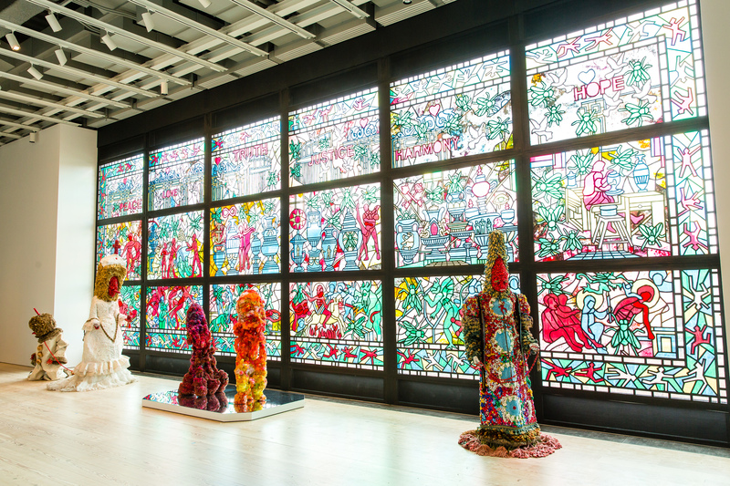
The museum has thoughtfully placed two long comfortable sofas facing the whole wall to make a close reading of the installation easier. While I was there, de Nieves sat not far away and clearly relished people’s delighted reactions to his style and taste. Fairly frequently, installation art juxtaposes a sculptural element to set against paintings or graphic works. Here, de Nieves takes a familiar structure and uses a narrative of large spiritual dimensions to end up with a feeling of grave matters, but expressed in a style that echoes popular sentiment and aesthetics of folk art. Some may see it as ironic, even mockery, and I suspect the reactions may depend on how you see those five standing figures with their hand-made, tourist-market surfaces.
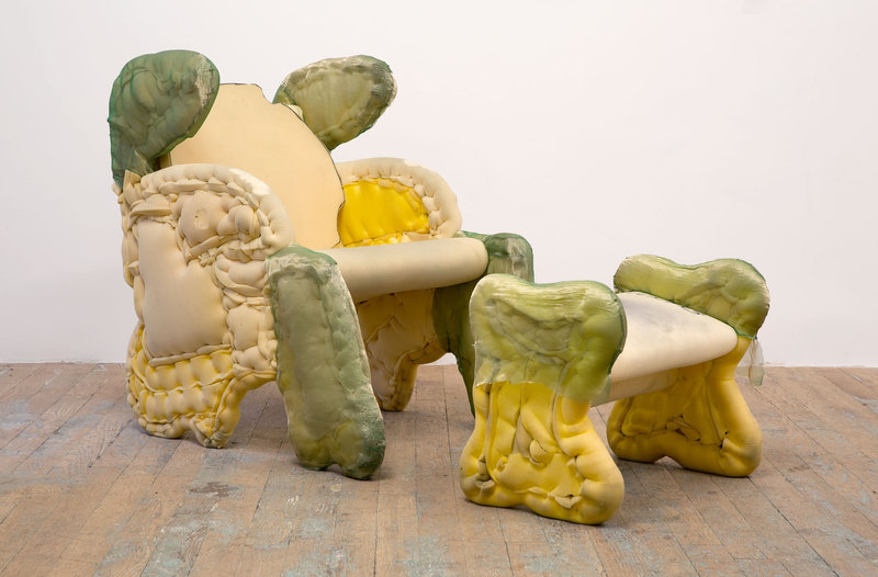
Using acetate sheets doesn’t qualify as a daring move in contemporary art, but it deserves at least some notice at the Biennial. Sharing use of this no-longer high-tech material with de Nieves is the quite challenging Jessi Reaves (b. 1986). If de Nieves’s work is the most eye-catching, Reaves’s is the most mind-bending. She incorporates her various materials into objects that consist of other high-tech substances and a very aggressively industrial sensibility. But even here we have to stop because the sensibility always manages to stretch back to a pure aesthetic. Reaves apparently loves the thick objecthood of what she makes, as she employs zippers, synthetic fabrics, and metal or plastic frameworks, all culminating in things that have no discerning usefulness even as they appear to have been hammered or sewn or extruded with a calm deliberateness. I kept thinking about the title of Harold Rosenberg’s book, The Anxious Object. A transferred epithet, because it is we and not the object that possesses, experiences the anxiety. “What is it?” used to be answered by who made it or what is it supposed to do. But with Reaves objects — made of industrial material but with an artisanal care — are all strangely forbidden and seem to answer to no one.
A brief digression. When I started viewing the show on the fifth floor I took advantage of two or three places where some form of seating was offered for the viewers. This was especially appreciated in front of large or difficult work. Later, as I ascended to the sixth floor, another seating arrangement was featured as a part of Reaves’s work, so again I took advantage. Shortly afterward a (very young) guard came to tell me I should not sit on that sofa, festooned as it was with a silk-like covering in almost luminescent pink. I jumped up, issued my apology, and referred the young guard to my experience on the floor below. Just as I finished, another guard came to tell me that, yes, people can sit on the Reaves’s sofa. Now it was time for the first guard to apologize, which he did most graciously. The moral can perhaps be reduced to, “Make sure all the guards get the memo.”
But now, how to end this gallimaufry? I’d recommend you visit the room with the paintings of Jo Baer (b. 1929). who represents, pretty much all by herself, the other side of the generational divide. You will see the work of a woman, such as Amy Stillman or Joan Snyder dedicated to abstract paintings. Are they a woman’s paintings? Yes. Do they share a community with others? Yes. Did they at first occur when abstraction seemed a male preserve? Yes. Are they deeply moving examples of what can be called — though not without dispute or objection — pure paintings? Yes, in spite of it all. She was there at the preview, greeting and being greeted by people looking for something different and for the same old thing. Like many indispensable artists, she appeared ready to wait. •
Images courtesy of The Whitney and Sharon Mollerus via Flickr (Creative Commons).