Young Lady

On a seemingly polite but nevertheless questionable title.

§

in Archive

EmailTwitterFacebookDigg

While I no longer think of myself as a girl, I’m not yet ready to claim the title of crone, which the feminist movement has redefined as wise old woman. Still, I’m on the dimming side of 65, and I’m not allowed to forget that the seventh inning stretch is over:  I’m reminded every time someone calls me “young lady.”


I hadn’t even qualified for Social Security when I was Young-Lady-ed for the first time.

A friend, 10 years my senior, told me that the man who parks her car calls her “young lady” each time he sees her.  We laughed about it as we walked to the garage. Sure enough, when she handed him her receipt, as though on cue he said, “Good afternoon, young lady.” And then he laid one on me.

I’ve taken an informal survey of my female friends, those in my age cohort and those in the decades ahead, and we’ve all been crowned with “young lady.”  One says her doctor greets her that way at every appointment — and he’s in his early 40s.  It can’t be that he doesn’t know her name; it’s right in front of him on her chart.

I’m sure these folk don’t intend actual disrespect.  Nonetheless, “young lady” is not the same as the deferential “ma’am.”  Far otherwise.

When I actually was a young lady — wearing little white gloves and a hat, crossing my legs at the ankle when seated — no one called me that with any regularity, but if I’d talked back to my parents, they might have said, “Don’t take that tone with me, young lady.”  And that observation leads to one reason why “young lady” makes me uncomfortable.

I find an implied hierarchy in the phrase, with the person wielding it assuming the power.  It diminishes dignity in a way that’s related to — though without the intended insult or attendant historic hatreds and violence — in calling a man “boy.”

Some of my older male friends are conscious of having being called, “young man” in situations where it might replace either “sir” or “hon.”

Feminist theory says the gaze is an indication of power — the gazer asserting power over the object of the gaze.  If you’re not a feminist, consider, instead, the lesson taught to children: Don’t stare; it’s rude.  The lesson is so ingrained by repetition—or so instinctive, that among ruffians, the question, “You lookin’ at me?” is the start of an argument that can lead to a brawl.

If the gaze is an indication of power, how much greater, is touch?   This subject goes beyond the rules in etiquette books about who ought to hold out a hand for a handshake.

About 10 years ago, half-watching TV, I saw a documentary of an aged leading man — Gregory Peck, I believe.  An unidentified man came up, laid his hand on the star’s arm, gave him a compliment, and left.  That sort of touch — not the intrusion of paparazzi, nor the wildness of mobbing fandom — marked his age.

When my father was 60, he had a full head of jet-black hair, so unusual for a man his age that a local shopkeeper told him he had a great toupee because it looked so natural.  She didn’t believe him when he said his hair was real.  I, however, take after my mother.

Like her, I grayed in my 30s, and with two swooping gray wings, one at each temple.  Had I been a man, I’m sure I would have been considered distinguished.  I celebrated my 50th birthday by returning to the hair-color of my birth.

Five years ago I decided to see what I looked like without chemical intervention.  The shampoo, designed for blondes and gray-hair, looks a lot like bluing (the a laundry product that was often used to make yellowed fabric white again.) The shampoo makes my hair silver, makes me feel downright glamorous — until I’m called “young lady.”

Those two words dispel all illusion of glamour. I’m reduced to being a little old lady with or without tennis shoes.

Other than the presumed rights of familiarity, I believe strangers treat me better now than they did when I was younger.  Or perhaps I’m more grateful for small acts of kindness.  It’s difficult to tease out an analysis of how I’m being treated now compared with how I was treated in the past: What’s due to my age, what to changing mores in, for example, door opening.

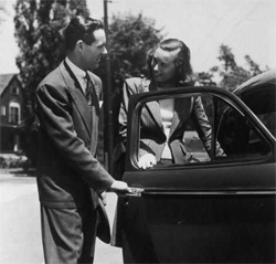
Certain behaviors used to be de rigeur.  Given a man, a woman, and a door, the man would open the door.  Any man.  Any woman.  Any door. And then, in the late 1960s, accusations of patriarchy shut down those courtesies: i.e., opening a door for a woman indicated she wasn’t capable of doing it herself.

One man who’s old enough to have been taught to open doors, whose old-fashioned manners survived the chill — one of those called “young man” by parking attendants and waitresses — adopts an ironic tone when he tells about the time he tried to open a door for a woman who was carrying a large bag of groceries and had a toddler in tow. They got to the door at the same time. He reached for the door handle, but she outmaneuvered him, grabbed the door, smiled, and held the door open for him. Telling the story he says, “It wasn’t as though I could stick out my elbow and shove her out of the way.”  It was, I think, her smile that stuck it to him.

Often now, when men and women hold doors open for me, I think that’s just fine. I refuse to frame the situation so that I appear (to myself) helpless.

A couple of months ago I was carrying a cup of coffee, a pocketbook, and a briefcase, making way from the line at Starbucks to the lounge where I hoped to find a big comfortable armchair in the sun.  As I entered the lounge, the lid popped off the coffee and some of it spilled on the floor.  Startled, I was calculating where to set down my coffee so I could mop up the mess.   I must have looked befuddled, because before I could step away from the spill, two young women — students — came up to me, asked if I’d been burned (embarrassed, yes; burned, no), took the coffee from me, got a new lid for it, and mopped up the floor with an efficiency and tact that moved me.  One of them offered to carry my book bag; the other took my coffee.  They didn’t hover, but were helpful, kind. And they never even once called me “young lady.” • 10 November 2009


EmailTwitterFacebookDigg

A hand glides across a packed bookshelf, dismissing countless volumes in mere blinks. Then, a single cover arrests its journey. That brief halt—the moment a potential reader truly notices—is the crucible.
Romance novel cover art either triumphs with dazzling success or fades into silent oblivion right then.
Consider the sheer scale: American romance publishing brings in more than $1.4 billion each year. And within this colossal market, a book's cover artwork stands as the paramount arbiter of its fate; it decides if a title is plucked from the shelf or simply ignored.
What follows unpacks the calculated design elements, mind-bending psychological tenets, and accepted industry benchmarks. These elements elevate romance novel covers from simple pretty pictures into potent engines of income.
Author, publisher, or graphic artist: grasp this. Forging truly captivating romance cover images directly shapes how readily books are found, what readers anticipate, and the ultimate tally of books sold.
Why Cover Art for Romance Novels Demands Strategic Design
Romance novel cover imagery follows distinct visual codes compared to other literary categories.
This happens because romance enthusiasts base their purchasing choices on particular visual hints. For example, Lauren Landish books comes with unique cover arts and edge colors and design tailored to her romance book genre. These cues hint at the story's overall feel, its level of intimacy, and the emotional journey promised within.
Unlike thrillers, which often underscore enigma, or literary fiction, which champions artistic expression, romance novel covers absolutely must convey genre expectations in fractions of a second.
The typical reader devotes a mere 1.5 to 3 seconds to examine a book cover before choosing whether to delve deeper. In digital marketplaces like Amazon, where thousands of romance titles vie for attention, that viewing window shrinks even more.
Publishers who pour resources into expert romance novel cover designs experience click-through rates from search results that are 20-40% higher than those with generic or shoddy covers. Such outcomes directly translate into algorithmic favoritism for books showing greater reader interaction.
Furthermore, a romance novel's cover cultivates reader confidence.
A skillfully wrought cover proclaims that the publisher or author treats the work with earnestness. This impression often corresponds with a heightened sense of the book's worth—irrespective of the actual manuscript's caliber.
Conversely, clumsy or poorly executed romance novel covers spark immediate doubt, leading prospective readers to assume the narrative itself is equally inferior.
The Psychology of Color in Romance Book Cover Design
The hues chosen for romance novel covers are not merely for decoration; they convey messages.
Distinct color schemes impart specific romance subgenre signals and emotional atmospheres to seasoned romance readers, who navigate this genre with a keen visual discernment.
Red holds sway over passionate, contemporary, and erotic romance. Around 65% of contemporary romance covers showcase red as a dominant hue, frequently paired with lustrous metals such as gold or silver. Red communicates fervor, longing, and immediate emotional stakes. Yet, plain red alone can feel common. The most potent romance novel cover art deploys red in refined pairings—think deep burgundy alongside blush tones, or spirited red accented by navy.
Soft pastels—blush, lavender, cream—point to sweet romance, new adult tales, or lighthearted contemporary narratives. These gentle shades lessen visual intensity and hint at emotional accessibility. Romance novel covers aimed at readers preferring emotional closeness over overt physical descriptions reliably feature pastel backdrops with illustrated or soft-focus visuals.
Deep jewel tones—emerald, sapphire, amethyst—set the stage for historical romance, paranormal stories, or darker modern accounts. These colors suggest opulence, riddle, and sophistication. Publishers creating romance novel cover art in historical or paranormal categories deliberately select jewel-toned palettes precisely because readers have learned to link these colors with those subgenres.
Gold and silver metallics express opulence and premium standing. When incorporated as accent colors or within the lettering on romance novel covers, metallics elevate a book's perceived worth. They entice readers seeking escape and aspirational tales. Metallic elements also boost clarity in thumbnail previews where digital vendors display books.
Typography: How Fonts Communicate Romance Subgenre
The selected typeface for romance novel covers acts as a genre indicator, every bit as significant as color psychology. Serif fonts—particularly elegant, sweeping serif varieties—grace 58% of historical and paranormal romance covers. They evoke classic romantic traditions and literary authenticity. Such fonts tell readers the story values emotional profundity and narrative complexity.
Contemporary and new adult romance often leans heavily on modern sans-serif fonts, frequently presenting geometric exactness or amicable rounded letterforms. This style of lettering in romance novel cover art proclaims approachability, relatability, and current-day settings. Specifically, rounded sans-serif fonts often hint at youthful main characters or emotionally frank stories.
Script and handwritten-style fonts frequently grace romance novel covers, but their presentation demands precision. When poorly executed, script fonts appear amateurish and hinder readability. Expert romance novel cover designs employ script fonts sparingly—typically for subtitles or secondary text—matched with robust sans-serif fonts for the main title. This preserves visual hierarchy and ensures clarity across all viewing dimensions.
The dimensions of type on romance novel covers absolutely must account for legibility in thumbnail views. A book cover appearing splendid at 8x10 inches may become indecipherable when shown as a 1-inch square on a mobile phone.
The most effective romance novel cover art positions the title in letters ample enough to remain clear when scaled down to 150 pixels, ensuring its discovery across all digital storefronts.
Imagery Choices That Define Romance Book Cover Performance
Romance novel cover art utilizes three main visual strategies: illustrated figures, photographic models, and abstract/textural backdrops. Each brings distinct advantages and cultivated reader anticipation.
Illustrated cover art for romance novels provides a creative malleability and an emotional vividness that photography simply cannot match. Illustrated covers dominate paranormal, fantasy, and historical romance realms. This is because illustration can portray supernatural elements, period-appropriate attire, and fantastical environments with complete artistic mastery. Top-tier illustration runs between $1,500 and $5,000, yet it yields singular visual distinction in crowded categories.
Photographic cover art for romance novels, showcasing model photography, holds sway over contemporary, erotic, and new adult romance categories. Approximately 72% of contemporary romance covers feature human models. Professional model photography expresses immediacy and genuine feeling. However, stock photography—which many independent authors adopt to reduce expenses—betrays an amateur production when the same models surface on numerous books, or when photographic quality falls short of professional benchmarks. Investing in bespoke photography or high-grade stock specifically licensed for book covers profoundly alters the perceived quality of the book.
Abstract and textural backgrounds in cover art for romance novels craft visual refinement while keeping production costs down. Gradient fields, watercolor effects, and textural components can cost considerably less than model photography or custom illustration, all while retaining a polished look. This method proves especially apt for contemporary romance, women's fiction, and emotional romance, where the emphasis rests on lettering and atmosphere rather than visualizing characters.
Strategic Positioning of Elements in Cover Art for Romance Novels
Expert romance novel cover designs adhere to particular compositional guidelines. These guidelines amplify visual resonance and uphold genre recognition. The title's placement occupies the upper 60% of the cover, guaranteeing it remains evident when books are lined up spine-out. The author's name appears conspicuously, yet subservient to the title, typically resting in the upper corners or the lower third.
Focal points in romance novel cover art—be they faces, embracing forms, or central imagery—reside in the center-right spot about 60% of the time. This placement mirrors reading tendencies, where eyes naturally drift toward the cover's right side. The most potent romance novel cover art arranges imagery to forge a visual flow from the focal point toward the title, guiding a viewer's gaze along a deliberate trajectory.
Taglines and series details show up in the lower 20% of romance novel cover art. Series branding—including the series title and book number—has become crucial for discovery, as digital algorithms increasingly discern series-related queries. Uniform visual branding across a series of romance novel covers heightens reader familiarity and bolsters series visibility in retailer recommendations.
Genre-Specific Design Standards for Romance Book Covers
Contemporary romance cover art spotlights relatability through clean lettering, vivid backgrounds, and often presents close-up faces or intimate couple images. Minimalist design proves effective in this realm because contemporary romance readers prize authentic emotion over visual embellishment.
Historical romance cover art for romance novels weaves in period-appropriate attire details, classical color schemes, and frequently showcases illustrated figures or carefully styled photography. Decorative design elements—flourishes, ornate borders, vintage typefaces—proclaim historical settings and warrant the premium pricing that historical romance readers anticipate.
Paranormal and fantasy romance cover art for romance novels embraces otherworldly imagery, dramatic lighting, and often features non-human characters or magical components. These covers generally employ darker color palettes and more intricate illustration than other romance subgenres, thereby conveying the expansive worldbuilding and fantastical elements readers expect.
New adult romance cover art bridges the gap between contemporary and paranormal aesthetics, typically displaying young adult-appearing characters in lively poses. These covers often blend softer color palettes and type styles that communicate intense feeling alongside youthful vigor.
Technical Specifications That Determine Cover Success
Romance novel cover art absolutely must fulfill specific technical demands across numerous retail venues.
Amazon KDP insists on a minimum resolution of 300 DPI and particular file measurements: 2,560 x 1,600 pixels for prime viewing.
IngramSpark, which channels books to thousands of stores, mandates a 1/8 inch bleed on all sides to compensate for printing inconsistencies.
Uniform file formatting guarantees that romance novel cover art appears consistently across various sellers. PNG format, with its embedded color profiles, keeps colors true. In contrast, JPEG compression can instigate subtle color shifts, disrupting visual hierarchy.
The divergence between expert color management and haphazard file conversion directly influences how romance novel cover art registers with prospective readers.
Thumbnail optimization stands as a vital technical consideration for romance novel cover art. When scaled to 150x225 pixels (Amazon's standard for mobile display), tiny text becomes unreadable, and delicate color variations vanish.
Scrutinizing romance novel cover art at actual display sizes across devices prior to publication prevents the discovery of legibility failures post-launch.
Practical Implementation: Creating Professional Cover Art for Romance Novels
Authors and publishers weighing custom design against template-based covers ought to gauge their long-term competitive standing. Custom romance novel cover art, ranging from $300 to $2,000, delivers uniqueness and a professional sheen that broadcasts serious publishing intent.
Template-based covers, at $25-150, however, risk looking too much like competitors' books, possibly hindering their discovery.
Collaborating with seasoned designers necessitates clear dialogue regarding genre norms. Supplying sample covers—instances of successful romance novel cover art in your specific subgenre—aids designers in grasping reader expectations and market benchmarks.
The most effective designer briefs outline: primary and secondary colors, the visual approach (illustration, photography, abstract), the desired mood of the typography, and any needs for series continuity.
Testing romance novel cover art before its release dramatically improves outcomes. Presenting mockups in romance reader circles and soliciting feedback reveals whether your cover genuinely conveys its intended genre signals to your actual target readership. This informal vetting catches any discord between authorial aim and reader perception well before investment in printing or permanent digital placement.
Key Takeaways
Professional romance novel cover art balances aesthetic allure with calculated genre communication. It employs color psychology, font hierarchy, and imagery choices to signal precise subgenres and emotional assurances to readers making rapid purchasing decisions. The technical specifications, compositional standards, and psychological principles discussed above elevate romance novel covers from mere decorative elements into powerful, conversion-focused marketing tools. These tools directly affect a book's visibility, its perceived excellence, and its ultimate sales figures.
Regardless of whether one commissions bespoke designs or opts for templates, prioritizing cover quality broadcasts a commitment to professional publishing benchmarks.
Romance readers discern this dedication and reward it with ongoing engagement and enthusiastic recommendations.

§