


They kindly replied to my enquiry, but asked for my understanding that the design of a pill — including its shape and color — is based on proprietary marketing considerations. For this reason, they cannot tell me more about why the color blue was chosen. For Viagra. How could I have dared to think that Pfizer would have the answer I was hoping for? And this reply didn’t exactly encourage me to ask the company a second serious question: Why do some people see everything tainted in blue (cyanopsia) as a side effect of taking the drug? In any case, I guess the pill wouldn’t have been as successful if it weren’t this particular shade.
The sky is often blue and so is the ocean, but snow turns blue only if it is thick and condensed enough. Blue is often associated with coldness, even sadness. But how could this possibly explain why blue is such a well-loved color — perhaps even the most popular one? Even scientists haven’t come up with a satisfactory answer. On Being Blue, an intimidatingly beautiful 1976 essay by William Gass (which discusses the remaining 99 percent of all possible blue things not mentioned here) reminded me that in German we have the idiom “ins Blaue hinein” — “into the blue” — which expresses the idea that something we might undertake is indefinite, spontaneous, with an undetermined outcome. Something done into the blue doesn’t even necessitate preparation. Or it normally does, and we just more or less consciously decide to overlook this fact. It’s an approach I prefer over more “rational” ones, if only because it makes a welcome surprise more likely. But I hope I never fall prey to the “blue disease,” which I also first heard about by reading Gass — and which further research revealed to be “a bluish-purple discoloration of skin and mucous membranes usually resulting from a deficiency of oxygen in the blood.” Let’s write an encyclopedia of things blue.
Johann Wolfgang Goethe, the great German poet-philosopher who couldn’t help also being a natural historian, reminds us in his (otherwise debatable) Theory of Colors (1810) that “the highest is to understand that all fact is really theory. The blue of the sky reveals to us the basic law of color. Search nothing beyond the phenomena, they themselves are the theory.” The phenomenological semiotician is left with his own observations. How about the limitations of blue? I thought that plants producing blue flowers were somewhat rare until I learned of a certain Dr. Dale Dixon, Curator Manager of the Royal Botanic Garden Sydney, Domain and Centennial Parklands, who has assembled a huge number of them.
Putting on a spectacle in the Royal #BotanicGarden Sydney Nursery is Plectranthus spectabilis #Lamiaceae #BlueFlower pic.twitter.com/7rwGajxkSH
— Dr Dale Dixon (@dale_dixon) July 22, 2016
When it comes to food, blue is mostly associated with danger of some sort. It makes sense, because mold is often blue, and so are poisonous berries or mushrooms. Blueberries and grapes are said to be blue, but with a little bit of good will their color can be seen as closer to violet. Then there are the blue beverages. I have never understood how people could enjoy Curaçao, even mixed with orange juice (and thus green). The only explanation may be that water is also blueish, so a blue drink has connotations of freshness and purity. A mildly successful mix of beer and lemonade called Babo Blue is, supposedly, colored with a mix of blueberries and black currants. Blue ice cream seems popular only among kids, who are more open to experimentation and haven’t looked deeply into all the complex meanings blue has to offer. Dying your hair blue also doesn’t seem right, unless you want to stand out (and at the same time appear somewhat old-fashioned, because I’m old enough to remember this style from the 80s). Nowadays, jeans are available in almost any color you can imagine, but are they authentic unless they are made of blue denim? Is there such a thing as “true red,” “white blood,” or a “green movie” for that matter? Even though we understand these expressions by cultural convention if we plug in “blue” instead, there is something indeterminate about them. And what’s the opposite of blue? Color theory 101 didn’t help much. Complementary colors are a different story.
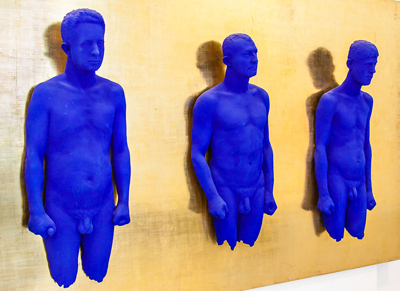
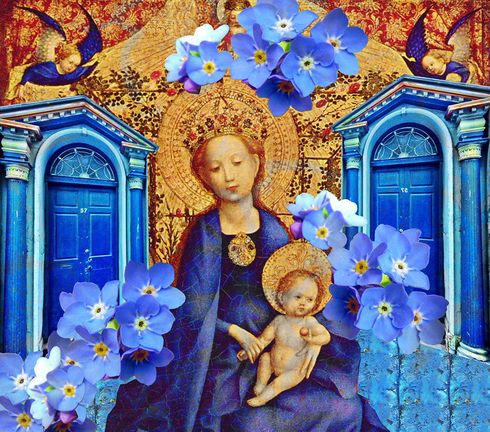
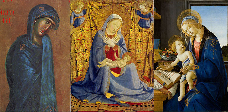
In his book on the color blue, French historian Michel Pastoureau extends his survey well into the past. Having surveyed vast numbers of documents and illustrations, he explains that the color blue was largely insignificant both socially and symbolically for millennia — from Neolithic times well into the Middle Ages. For a long time, red figured as the principal color. Old texts often don’t mention the color blue at all, as if it didn’t exist. To a certain extent, though, the use of certain colors seems to have been dictated by what was chromatically possible. As Pastoureau points out, 19th-century scholars even asked whether people were capable of discerning this color in the more distant past, or if they may have perceived it differently. In the 12th century, the Virgin Mary’s garment started to be associated with a pale, friendly ultramarine blue, and church windows were painted blue as well. (French artist Yves Klein was inspired by the Madonna’s blue in medieval paintings when he patented “Yves Klein Blue.”) The use of this color then in turn strongly revalued blue in medieval society, for example in family crests — even though it was replaced or supplemented by gold in many instances a few centuries later. Its popularity among the aristocracy, patricians, and kings prevailed: royal blue.
While Blue is an interesting book, we have to remember that Pastoureau always stays within the confines of his own cultural sphere. The picture is much more complex if you look at the use of blue(s) outside the Western European context. I wonder what he would have made of the amazing tile mosaics from Mesopotamia, which date back 5000 years.
Surprisingly, even in more recent times the things we normally consider blue today were not automatically associated with that color. For example, French artist Claude Monet proclaimed that “the true color of the atmosphere is violet — fresh air is violet.” He indeed used cobalt and manganese violet pigments available at his time. Was this simply a move against convention? Or did Monet actually perceive colors differently?
There is no simple explanation for the “fact” that blue remains the most popular color — unless you resort to Jungian archetypes for an explanation (please forgive me for not bothering to look into them). In the end, blue is just color: a certain wavelength that produces a specific effect on the retina. In this sense, color is “real” only in the eye of the beholder. And in a way it’s a relief to know that some things still cannot be explained. I comfort myself with the idea that somebody used to know the answer and just happened to forget it.
And yes, I had to take a break in writing this for two weeks, because I was feeling blue — although the color itself was not responsible for my state of mind. •
Feature image by Maren Larsen. Source images courtesy of mrmole and Maree Turner via Flickr and The Yorck Project via Wikimedia Commons. Other images courtesy of the author, Justin via Flickr, and Shakko, National Gallery of Art, and DcoetzeeBot via Wikimedia Commons (Creative Commons).